Reducing new user onboarding time by 66% using AI
Designing an Agentic AI assistant that moved beyond "smart search" to provide synthesised guidance, cutting developer ramp-up from 5 days to 8 hours.
Role
Lead Product Designer
Timeline
2 months
Team
1 Designer, 3 Engineers, 1 PM
Skills
Product Design, Frontend Engineering, User Research
TL;DR
The problem: Venue.sh's success became its own enemy. As customers populated their IDPs, they became "Data Monoliths." New engineers were drowning in documentation, spending days just finding the context needed to ship their first line of code.
The solution: I led the 0-1 design of a context-aware AI Assistant. We moved beyond standard chatbots to create an "Agentic Guide" that proactively summarises complex systems, detects intent, and executes workflows.
The insight: Users didn't want a faster way to find links; they wanted a faster way to find answers. We pivoted from a "Search Engine" model to a "Synthesiser" model when we realised that raw search results, even AI-powered ones, still required high cognitive load to parse.
The outcome: The AI Assistant reduced the average time-to-first-commit for new hires to under 8 hours and significantly reduced "Where do I find...?" support tickets for platform teams.
How can we solve the "Data Monolith" problem without deleting data?
My goal for this project was to solve a very human problem: the feeling of being overwhelmed. As Venue.sh customers scaled, their Internal Developer Portals (IDPs) grew into sprawling libraries of thousands of services and docs.
For a tenured engineer, this was a goldmine. For a new hire, it was a labyrinth.
As the sole Lead Designer in a small 'triad' (1 PM, 3 Engineers), my challenge was to validate a solution that could pierce through this noise. We had 2 months to prove that AI wasn't just a buzzword, but a viable tool for clarity.
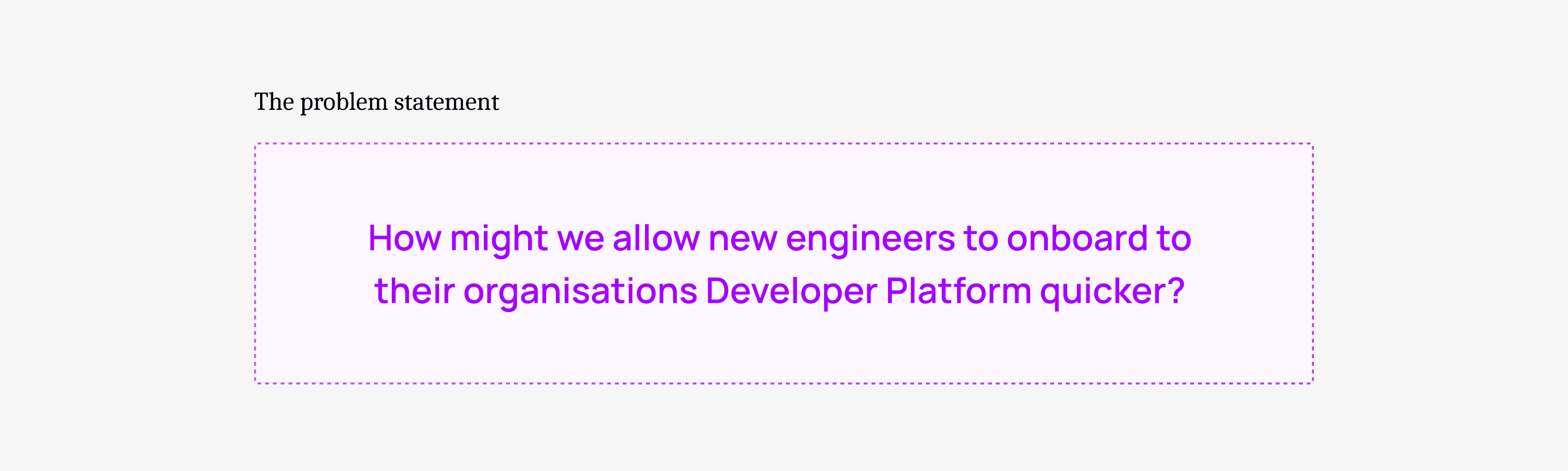
Why was more data making our users less productive?
I found a critical friction point: The "Context Gap."
Our analytics showed that users were searching, but often abandoning their sessions. The sheer volume of information meant that even when a user found the right document, they lacked the context to understand how it applied to their specific problem.
This surfaced in two key ways:
Onboarding was a treasure hunt: New engineers were "reading" for days but "doing" nothing. Managers were losing productivity acting as human encyclopedias.
Search gave links, not solutions: When a build failed, users searched for the error code. They got 50 logs. They didn't need a list of logs; they needed to know why it failed.
The problem wasn't "bad search." It was a lack of synthesis.
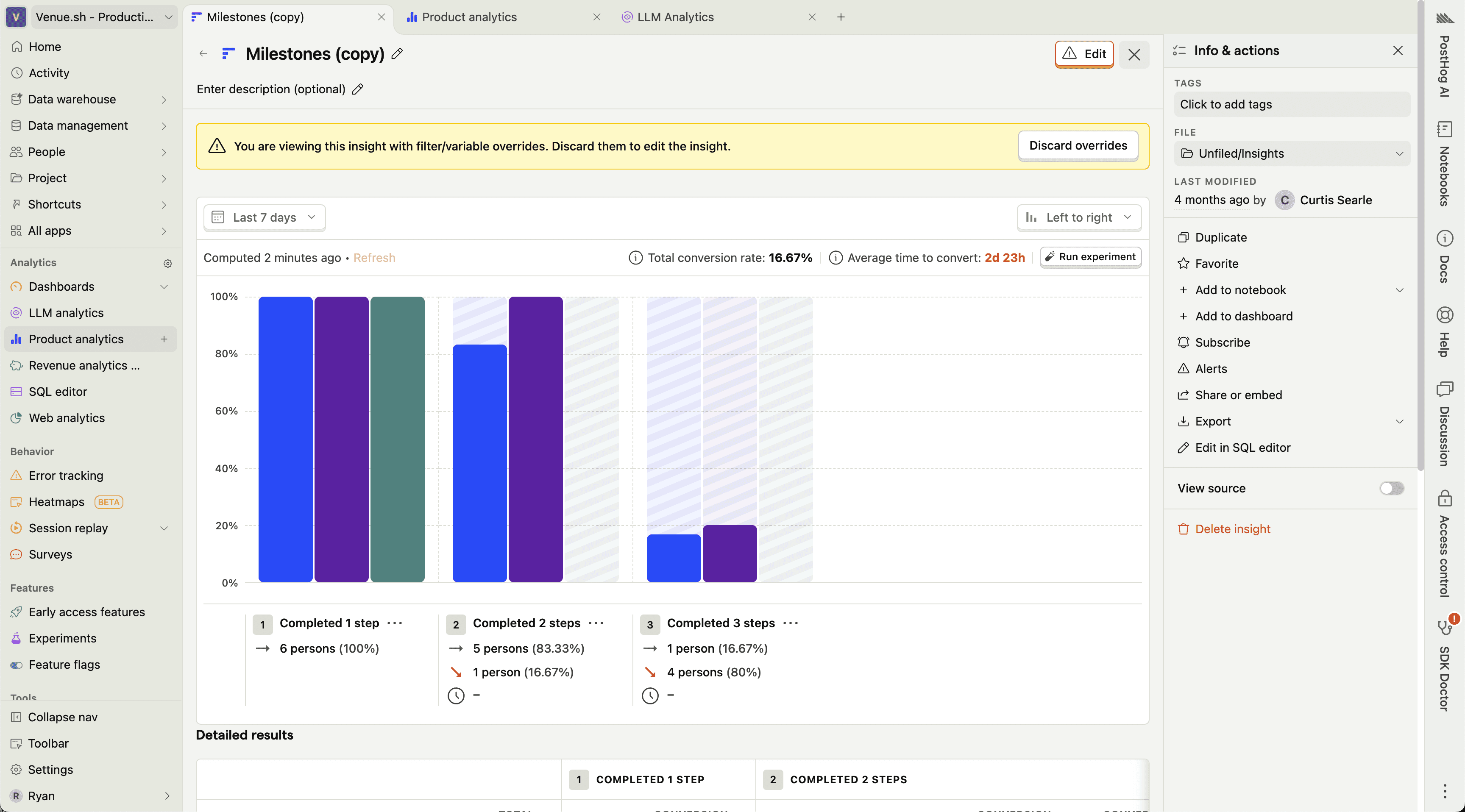
Fig 1. Using Posthog to review session data.
Separating the AI hype from the actual user need
I needed to separate the AI hype from the actual user need.
I led 8 remote interviews with Engineering Managers and recently hired engineers. I invited my PM and Eng Lead to sit in, ensuring we all heard the user's struggle firsthand.
I synthesised these findings into three core design principles:
Trust over magic: If the AI guesses, say so. Transparency is the foundation of trust.
Guide, don't just Answer: Be a partner. If a user asks X, check if they actually need Y.
Always context-aware: The AI should know who you are (e.g., a new hire) and adjust its tone and depth accordingly.
Moving from "Search" to "Agentic Guide"
The research clarified our mission. We weren't building a tool to retrieve information; we were building an agent to interpret it.
The vision became an Agentic AI Layer that sat on top of the IDP. It wouldn't just index pages; it would read them, understand the relationships between services, and offer proactive guidance.
Testing if users wanted "Magic" or "Clarity"
My process was defined by a rapid "Build -> Break -> Fix" cycle. Our first failure was our most important lesson.
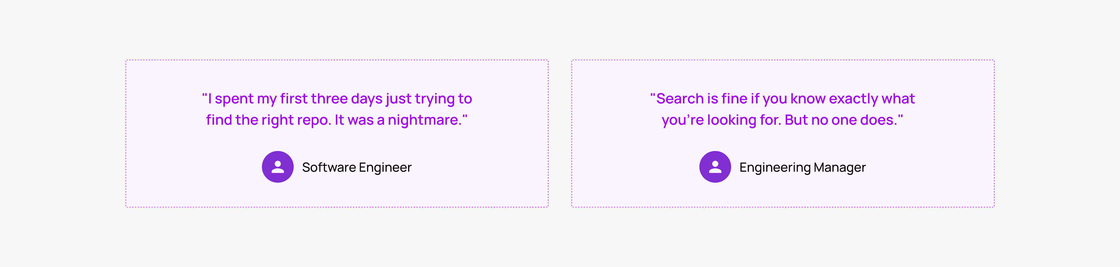
Iteration 1: The "Faster Search" (Hypothesis Invalidated)
Our first concept was a "Magic Search" bar. You typed a question, and it used an LLM to rank the results better. We thought speed was the value prop.
Testing with 6 users crushed this idea:
"This is just a faster search bar. I still have to open five links to find my answer. I'm still lost."
Pivot! Our insight: The friction wasn't in finding the document; it was in reading it.
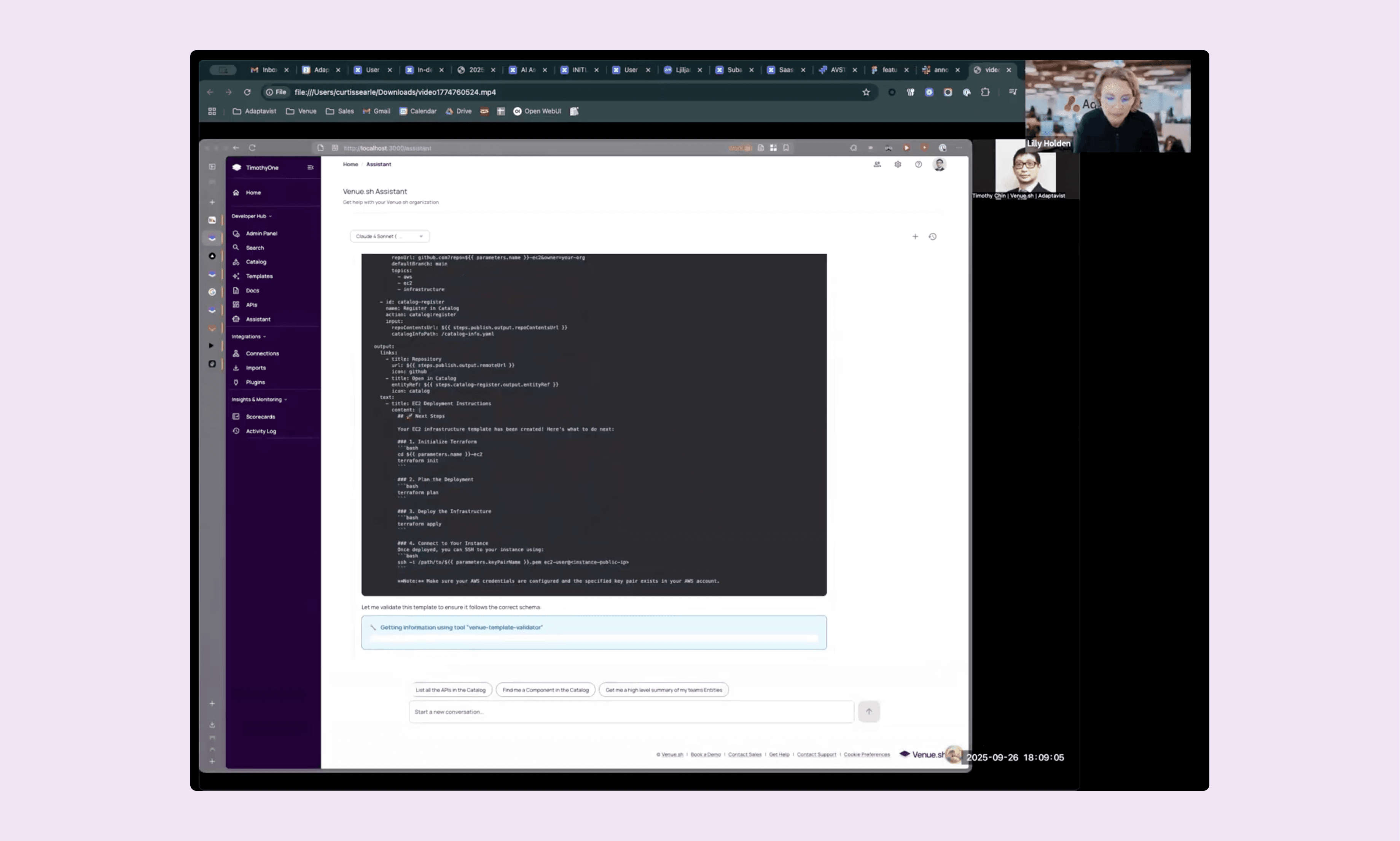
Fig 2. Testing an early version of the AI Assistant.
Fig 3. iteration work for the AI Assistant
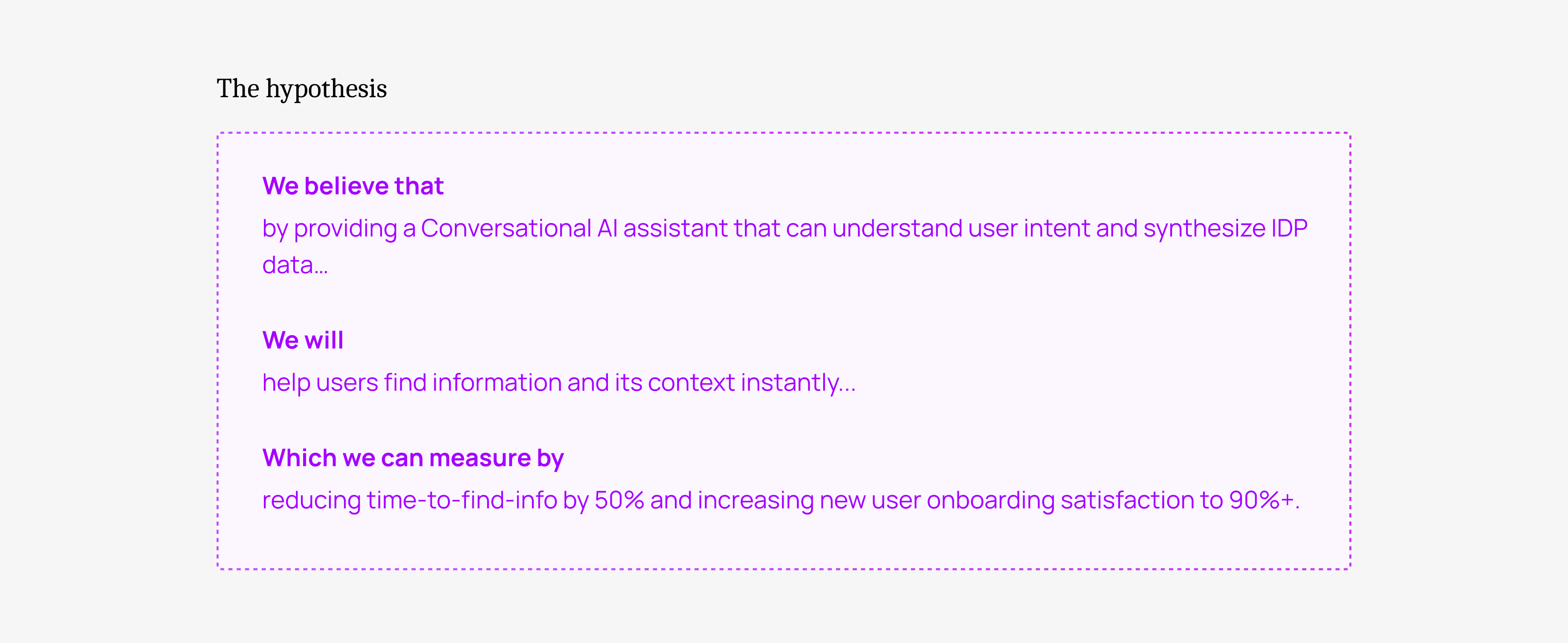
Iteration 2: The "Synthesiser" (Hypothesis Validated)
I went back to the drawing board. The new concept: The AI reads it for you. Instead of a list of links, the AI would ingest the top 5 results and generate a synthesised answer with citations.
The reaction was a 180:
"Wait, it just told me why the build failed and suggested the fix? I'd actually use this."
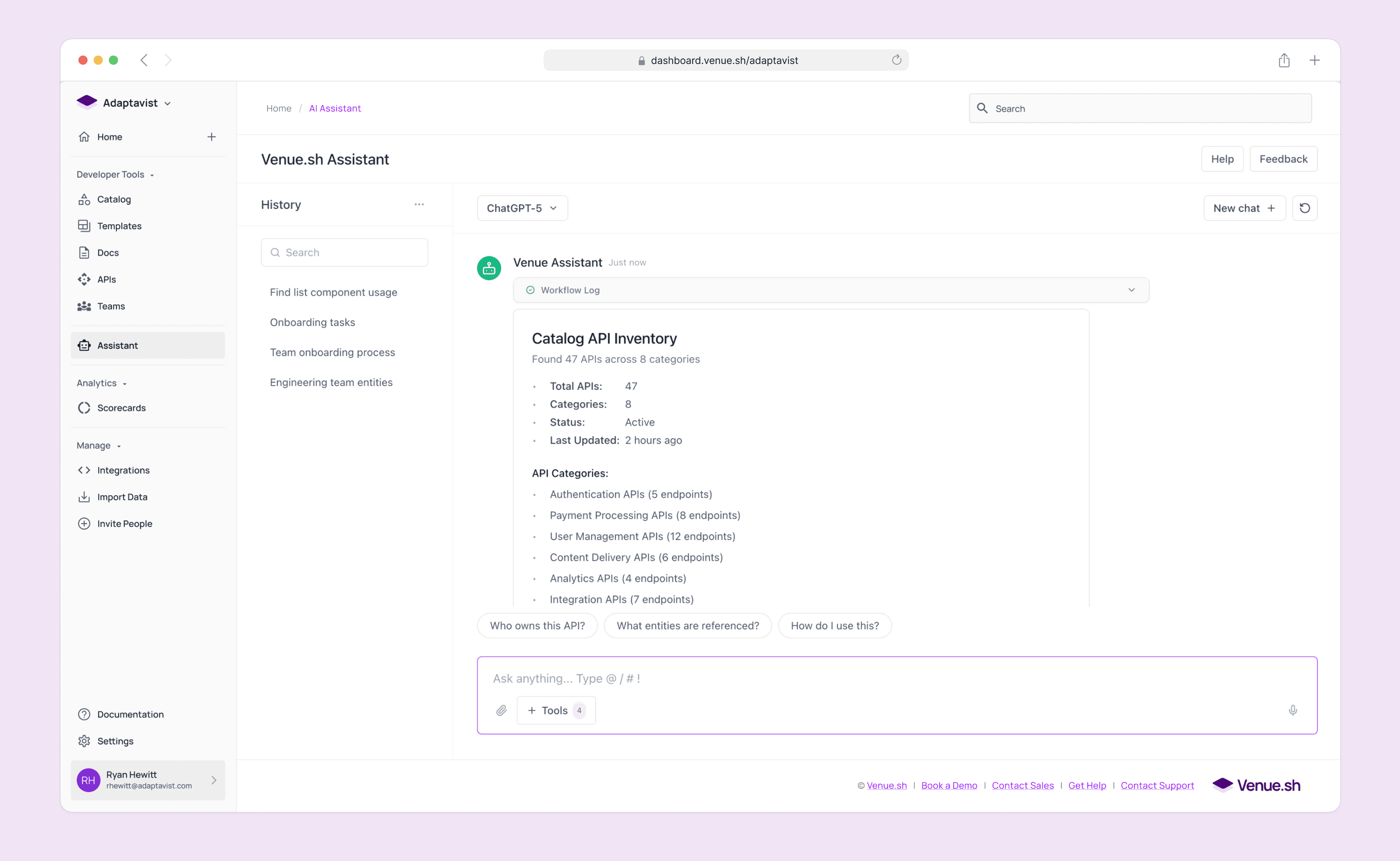
Fig 4. Iterated UI based on user feedback from usability testing
Designing for trust in a "Black Box" system
This pivot led to three critical design decisions that defined the final product.
Synthesise, don't just search: We designed the backend to act as a research assistant. It fetches logs, docs, and code snippets, reads them, and writes a cohesive summary. This solved the "Context Gap."
Proactive Onboarding: A new user doesn't know what to ask. We designed the Assistant to be Context-Aware. If it detects a user is logging in for the first time, it proactively offers a "Tour of the Architecture" or "Setup Guide," transforming a blank search bar into a welcoming guide.
Transparency UI (Building Trust): Users are skeptical of hallucinations. I designed the UI to "show its work." Instead of a spinning loader, we displayed real-time steps: "Reading build logs...", "Checking service dependencies...", "Summarizing findings...". This visual transparency made users trust the output significantly more.
Where we landed: An intelligent layer over the monolith
We launched the V1 Assistant with a focus on three "Agentic" capabilities.
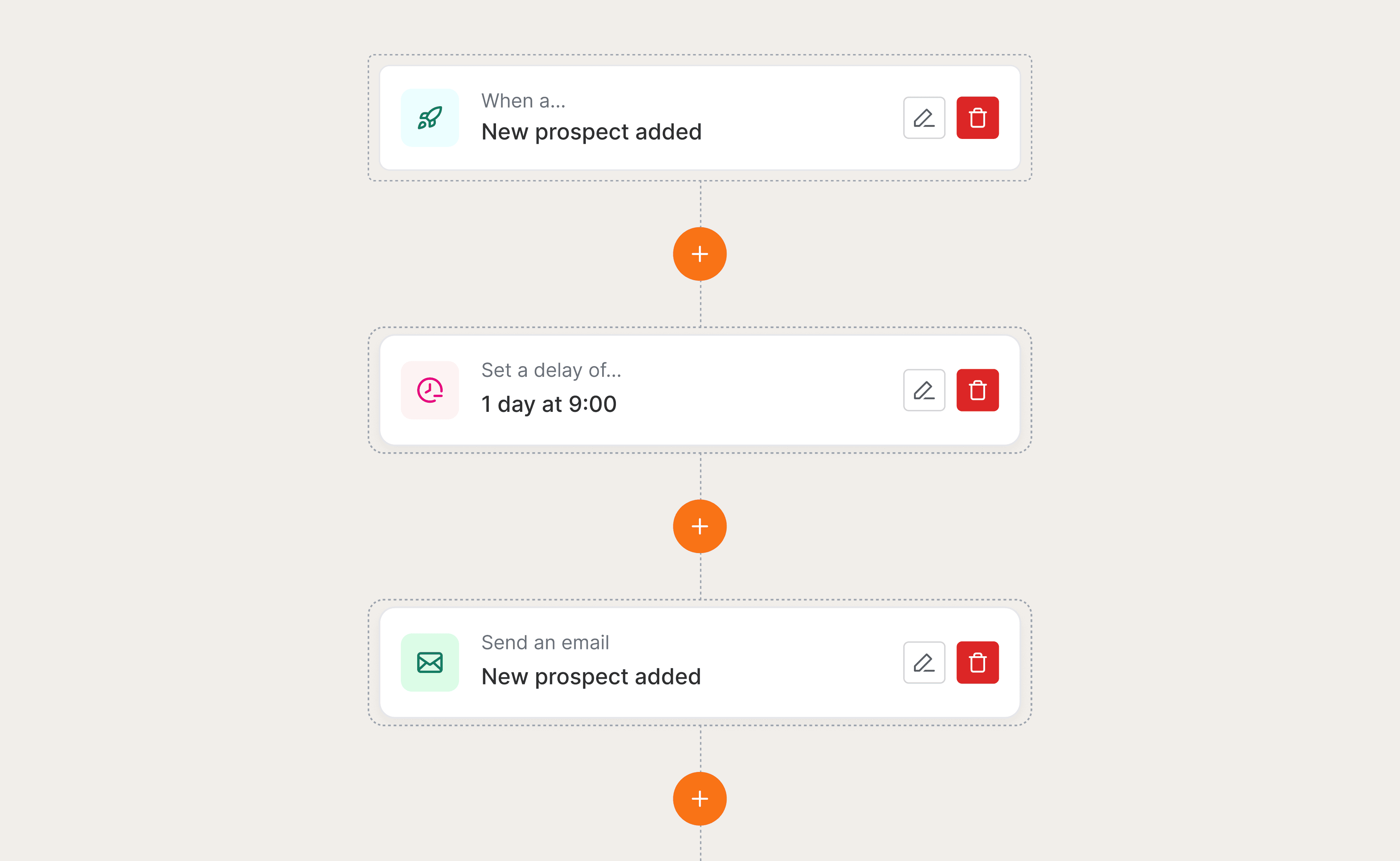
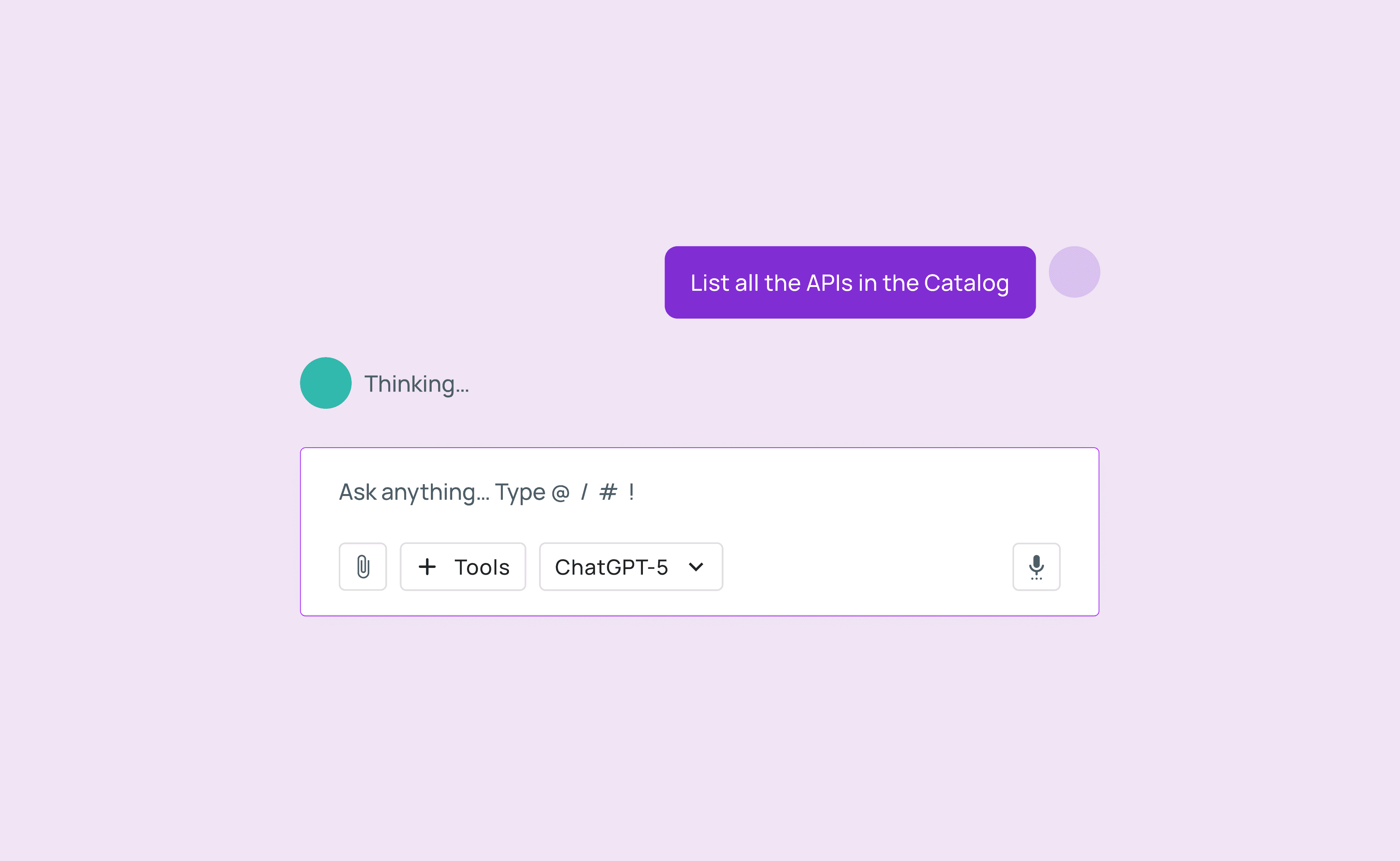
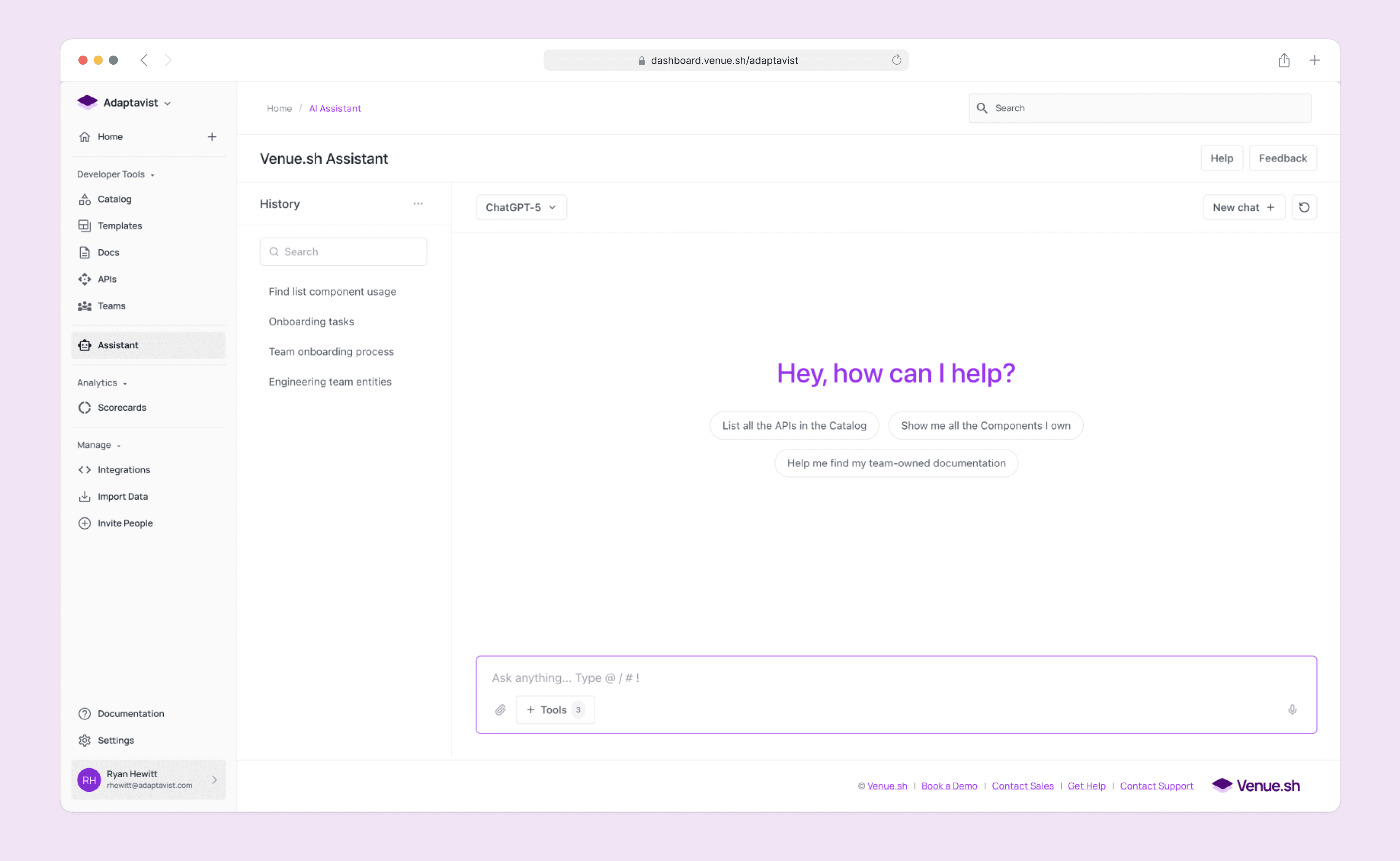
The Conversational Guide The core chat interface. It uses tool extensions to check live build statuses and synthesise answers from across the platform, turning 15 minutes of investigation into a 30-second answer.
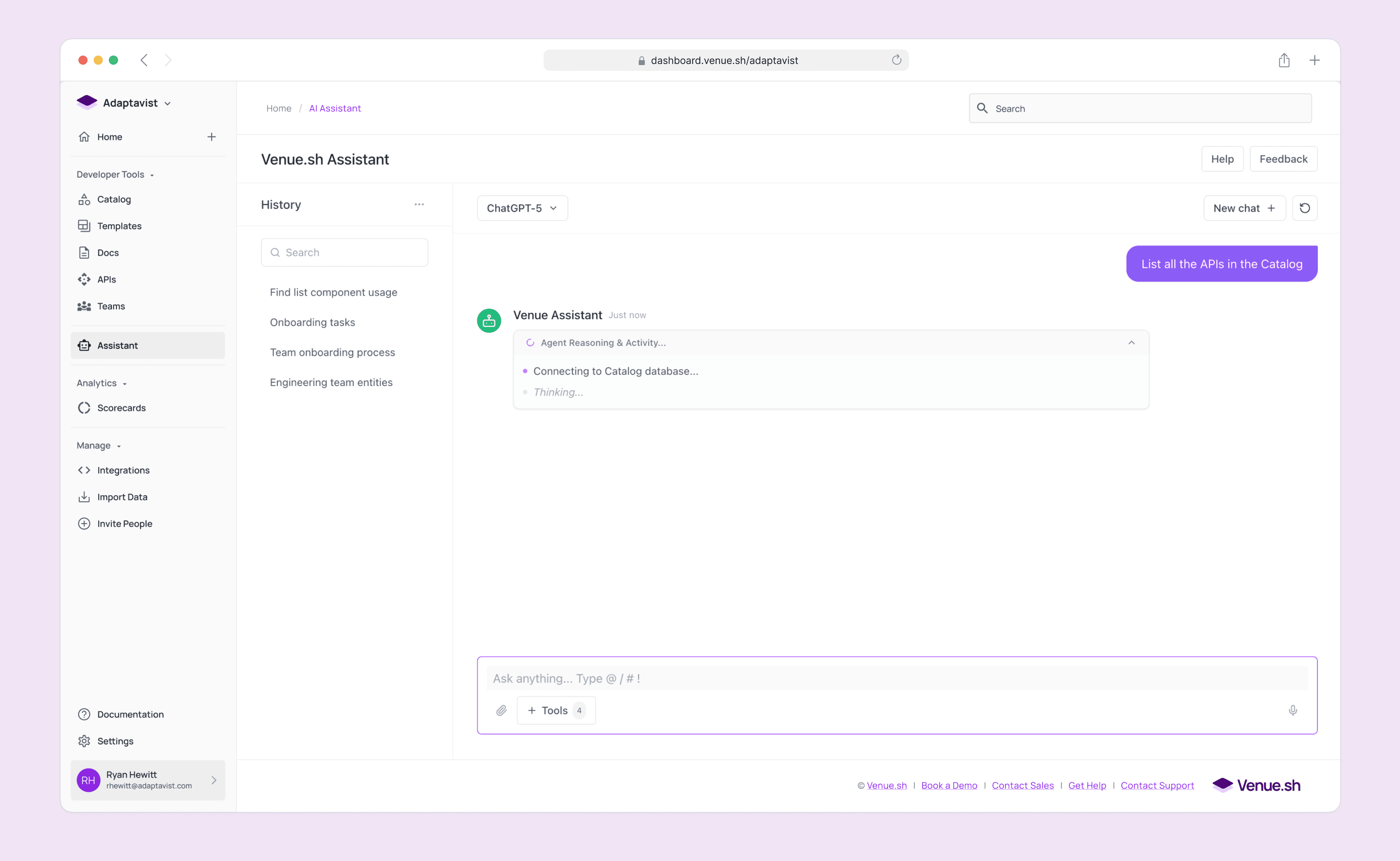
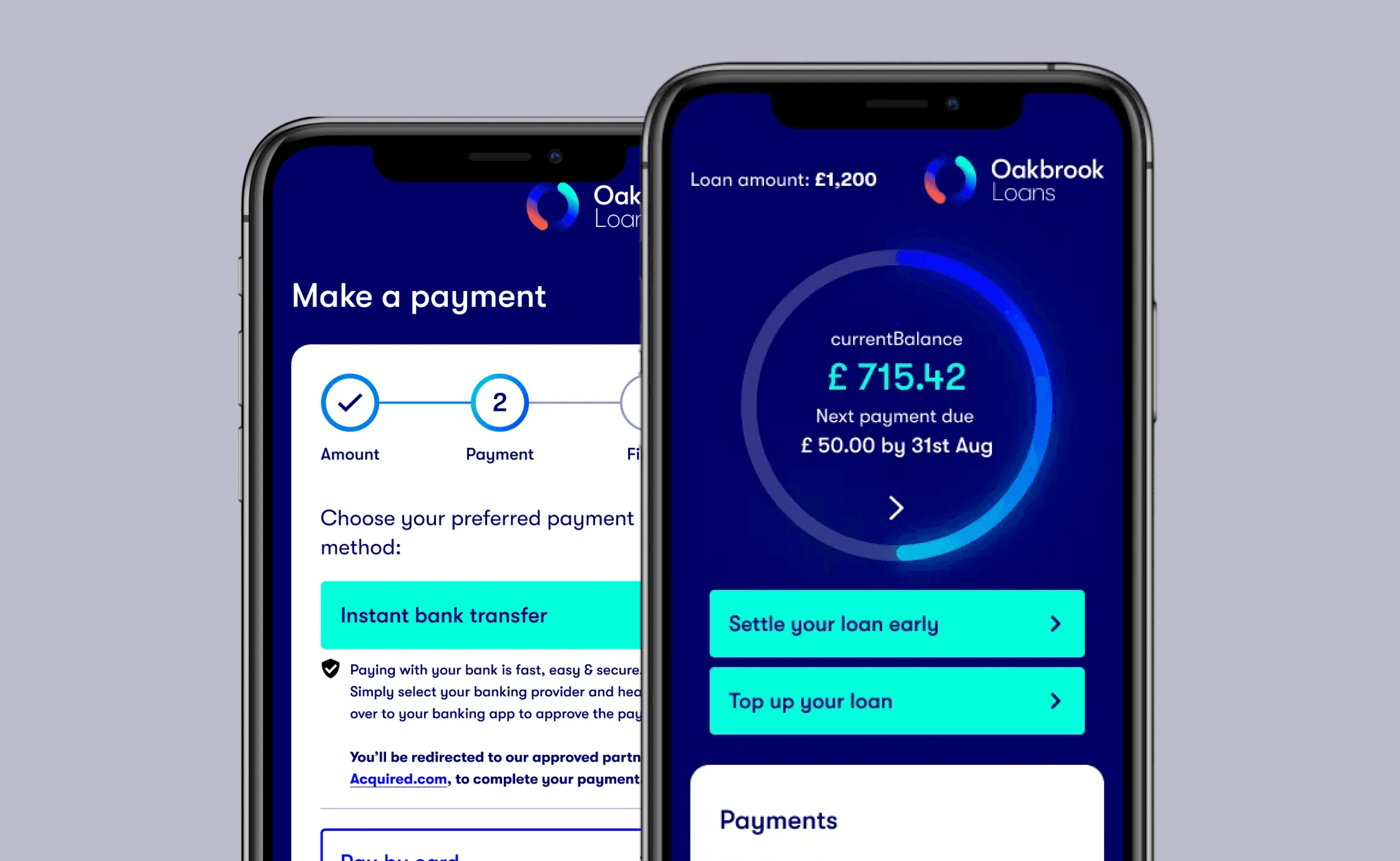
Fig 5-7. Prompting journey through the AI Assistant
Fig 8. Building a functional prototype with Cursor and exploring interactions
Smart Summaries A "Too Long; Didn't Read" button for every entity. We used AI to generate instant, one-paragraph summaries of complex microservices, allowing new hires to skim the entire architecture in minutes.
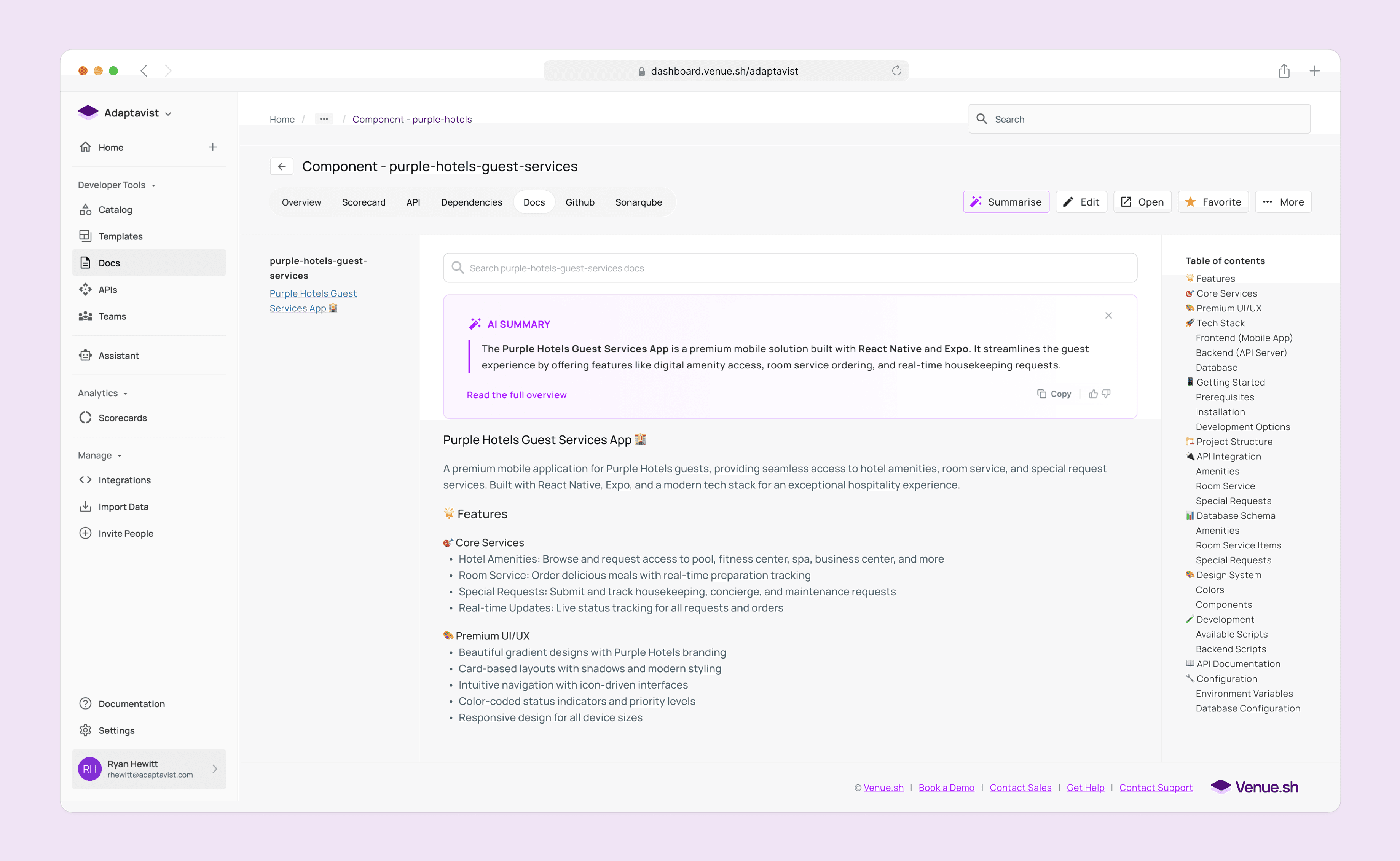
Fig 9. UI iteration for showing the AI summary within the entities documentation
Fig 10. Creating an interactive prototype to show engineers how the AI summary panel should behave.
Agentic Workflows We moved beyond text. Users could command the AI to do work, such as "Run the end-to-end QA suite" or "Detect bugs in this PR." This validated our long-term vision of an autonomous developer companion.
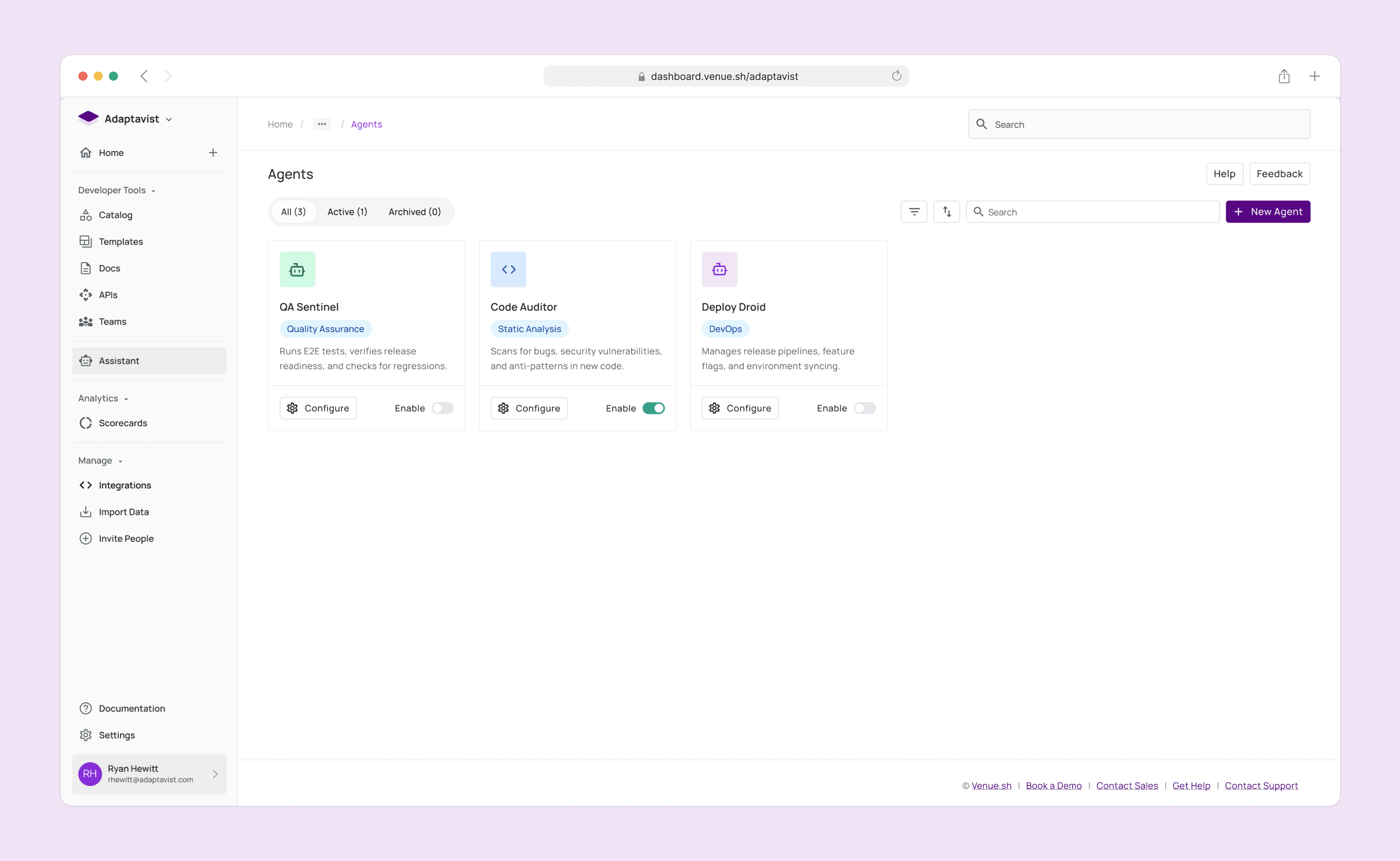
Fig 11. List view of configured agents
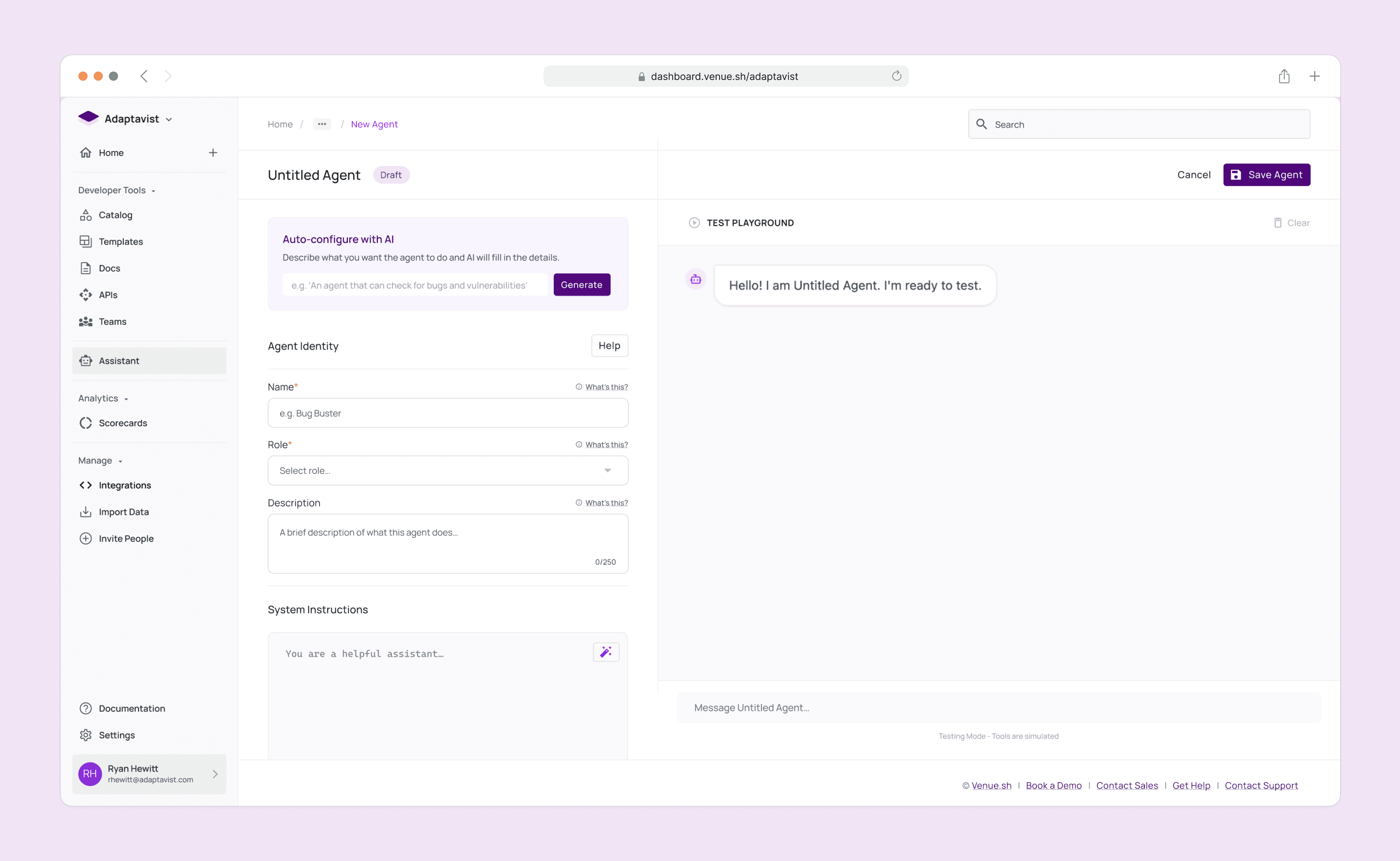
Fig 12. Configuration screen for the Agent builder
Fig 13. Using Cursor to build a functional prototype to review with Engineers
Reflecting on "Synthesis" as the killer feature
This project was a masterclass in looking past the technology to find the human need.
The "Magic" trap. We almost shipped a fancy search bar because it was technically impressive. User testing saved us by revealing it offered no human value.
Trust is a UX problem. The most important UI element wasn't the chat bubble; it was the "status text" showing the AI's thinking process. That tiny detail bridged the gap between skepticism and adoption.
Synthesis is the killer feature. In a world of data overload, the tool that summarizes wins.
We proved that AI in DevOps isn't about writing code for you; it's about helping you understand the code that's already there.
Go Back