Reclaiming 10 hours of weekly admin through no-code automation
Designing a visual "Automation Builder" that transformed a passive CRM into an active digital employee, saving martial arts club managers 10+ hours a week.
Role
Lead Product Designer
Timeline
3 months
Team
1 Designer, 4 Engineers, 1 PM
Skills
Product Design, User Research, No-Code Tools, Automation Logic
TL;DR
The problem: Martial arts club owners were victims of their own success. As their clubs grew, so did the "admin tax" - manual reconciliation, payment chasing, and student follow-ups. Owners were spending 15+ hours a week on data entry, leading to severe burnout.
The solution: I spearheaded the 0-1 design of a No-Code Automation Builder. We replaced static forms with a visual canvas that allowed non-technical owners to build complex, "If this, then that" workflows to run their business on autopilot.
The insight: Users didn't suffer from a lack of information (dashboards); they suffered from a lack of execution. They didn't need a tool to tell them a payment failed; they needed a tool to fix it.
The outcome: The feature eliminated an average of 10 hours of manual admin per user per week, directly reducing churn caused by owner burnout and becoming the platform's highest-value differentiator.
Could a no-code tool give non-technical entrepreneurs their time back?
My goal for this project wasn't just to ship a feature; it was to save our users' sanity. NEST Management serves passionate martial arts instructors. These are experts in the dojo, not in database management.
As the Lead Designer in a lean product triad, I was tasked with addressing a vague "automation" goal. The challenge was immense: How do you give powerful, developer-grade logic tools to users who have never written a line of code, without overwhelming them?
Fig 1. Interactive prototype demoed to NEST's customers during their monthly 'NEST hours' - It received amazing feedback and shortly followed up with some usability tests.
Why did success feel like a punishment for our users?
We uncovered a painful paradox: The Growth Trap.
The more successful a club became, the more the owner was punished with administrative overhead. The CRM, intended to enable growth, became a prison of manual tasks.
This manifested in two distinct pain points:
The weekend "admin hunt": Owners were manually reconciling bank statements against class attendance lists every weekend. It was a high-stakes game of "spot the difference" where a single mistake cost revenue.
The "nagging" dashboard: Existing tools were great at highlighting problems (e.g., "20 Failed Payments"), but offered no solution. This created more anxiety, as the dashboard became a growing to-do list that the owner had to tackle manually.
The problem wasn't that the data was missing; it was that the action was manual.
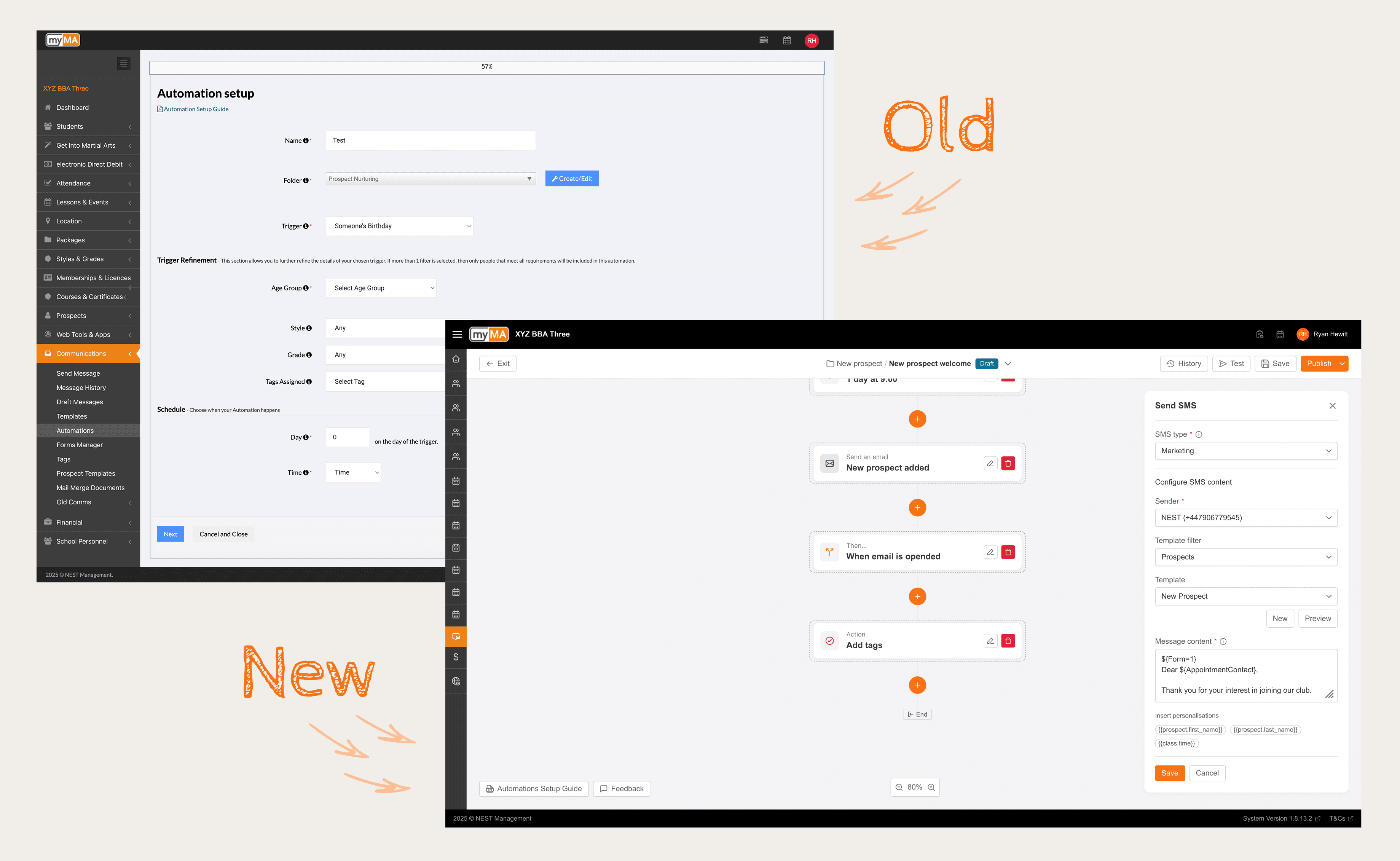
Fig 2. Comparison of old vs new Automation UI & UX. Moving from a rigid form into a canvas style builder.
Uncovering the human cost of manual administration
I needed to understand the emotional toll of this friction.
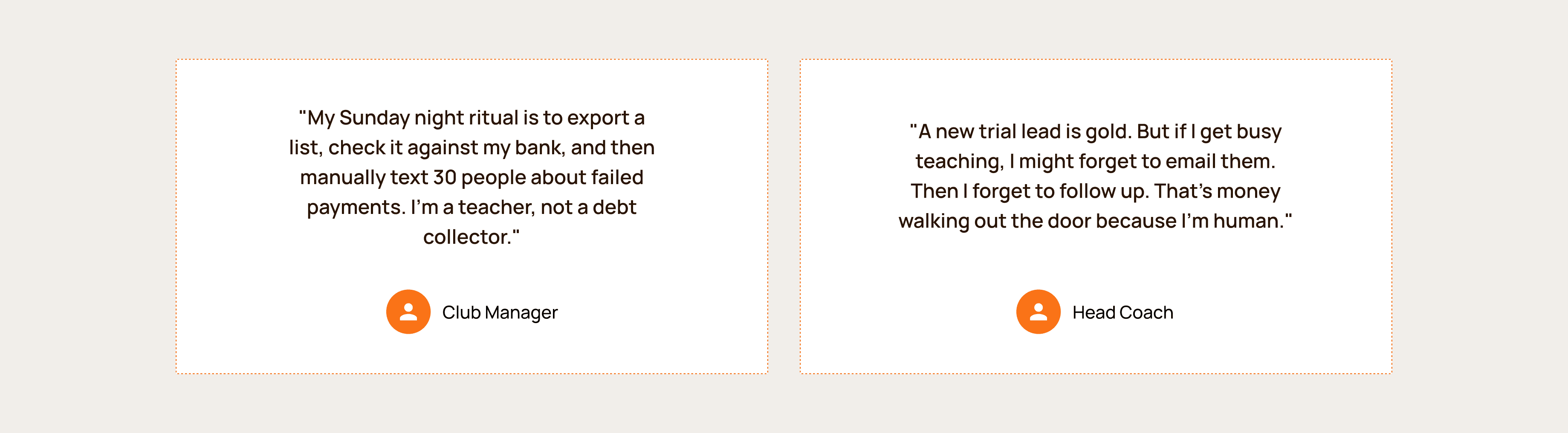
I conducted 10 remote interviews with club owners, bringing my PM and Engineering Lead along. We didn't just ask about their workflows; we asked about their weekends.
The feedback was visceral. We heard stories of owners staying up until 2 AM to send "Happy Birthday" emails manually or chasing payments via text message during family dinners.
I synthesised these findings into three design pillars:
User as the author: Don't just give them pre-canned recipes. Empower them to build logic that fits their specific school's culture.
Trust by default: If a machine is sending emails to students, the owner needs 100% visibility. Transparency is non-negotiable.
No-Code or nothing: The UI must be visual. If it looks like code, we've failed.
Shifting the strategy from 'Reporting' to 'Execution'
The research clarified that a better dashboard would just be a "prettier problem list."
The opportunity was to build an Autonomous Digital Employee.
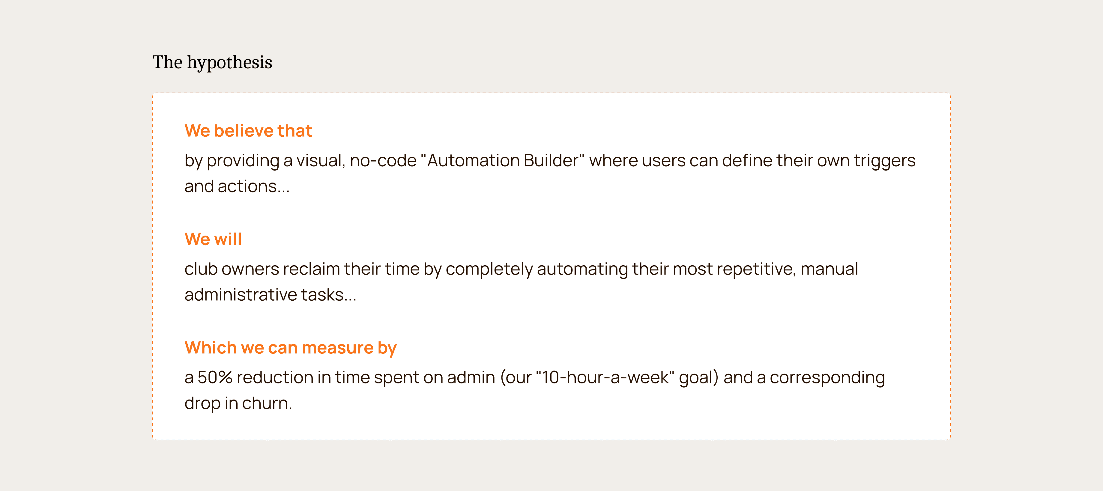
Our vision shifted from "Better Reporting" to "Visual Automation."
We hypothesised that if we could let owners "program" their business logic visually, they could reclaim their time and focus on teaching.
How do you make code logic invisible to the user?
This pivot to a "Canvas" model required three specific UX solutions to make it usable for non-tech users.
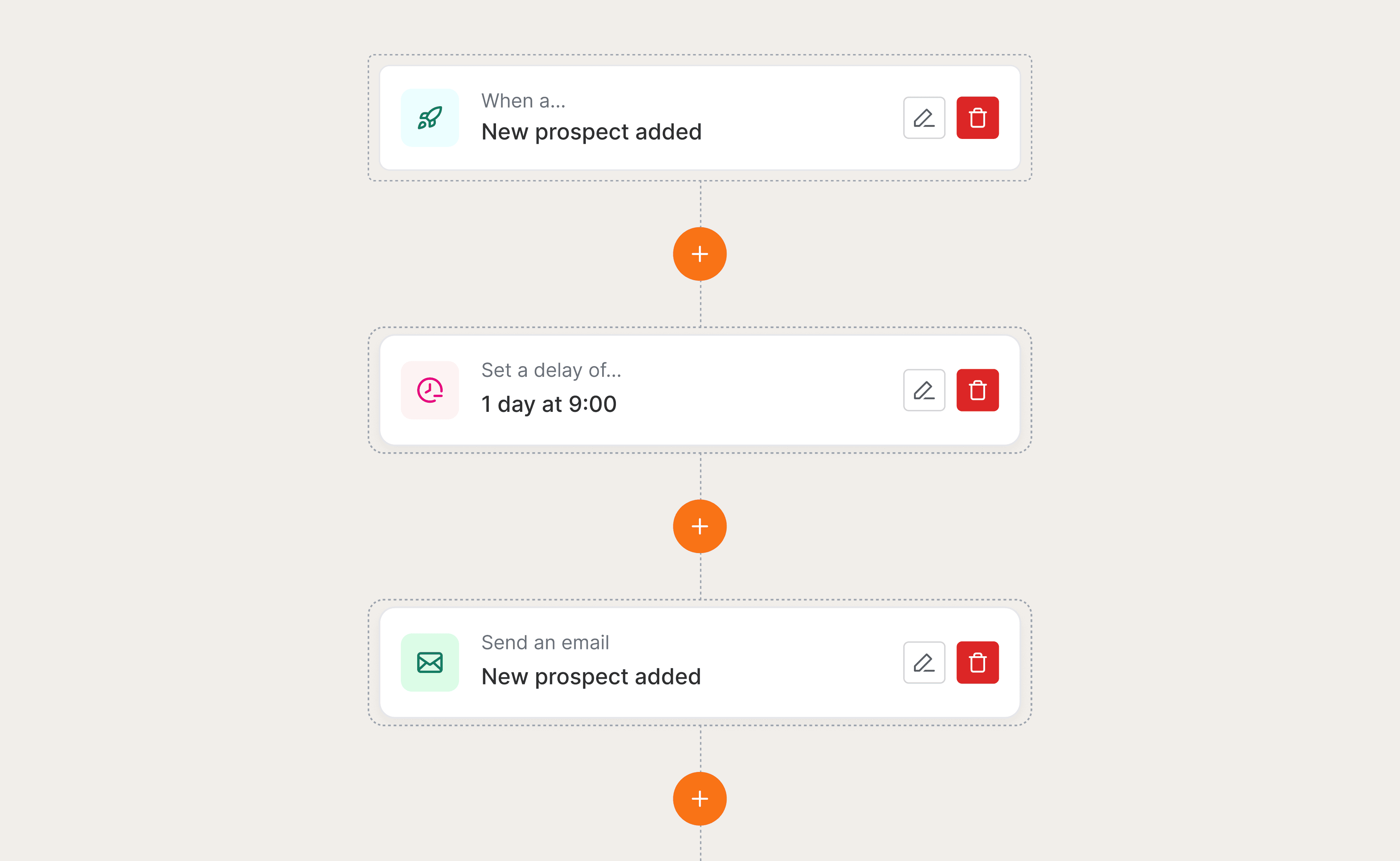
The infinite canvas: To manage complex workflows without cramping the UI, I designed an infinite scrolling canvas. This allowed users to visualise the "journey" of a student linearly, making the logic easy to trace (e.g., Trigger -> Delay -> Action).
Human-readable logic: We avoided technical jargon like "If/Else" or "Boolean." Instead, we used natural language sentence structures in the UI: "When [Trigger] happens, Wait [Time], then do [Action]." This lowered the cognitive barrier to entry.
The "Safety Net" (Test Mode): Users were terrified of accidentally emailing their entire student base. I designed a robust "Test Mode" and "Simulation" feature, allowing users to run the automation against dummy data before publishing. This built the necessary trust to deploy.
Where we landed: An always-on digital employee
We launched the V1 Automation Builder with a robust feature set that balanced power and simplicity.
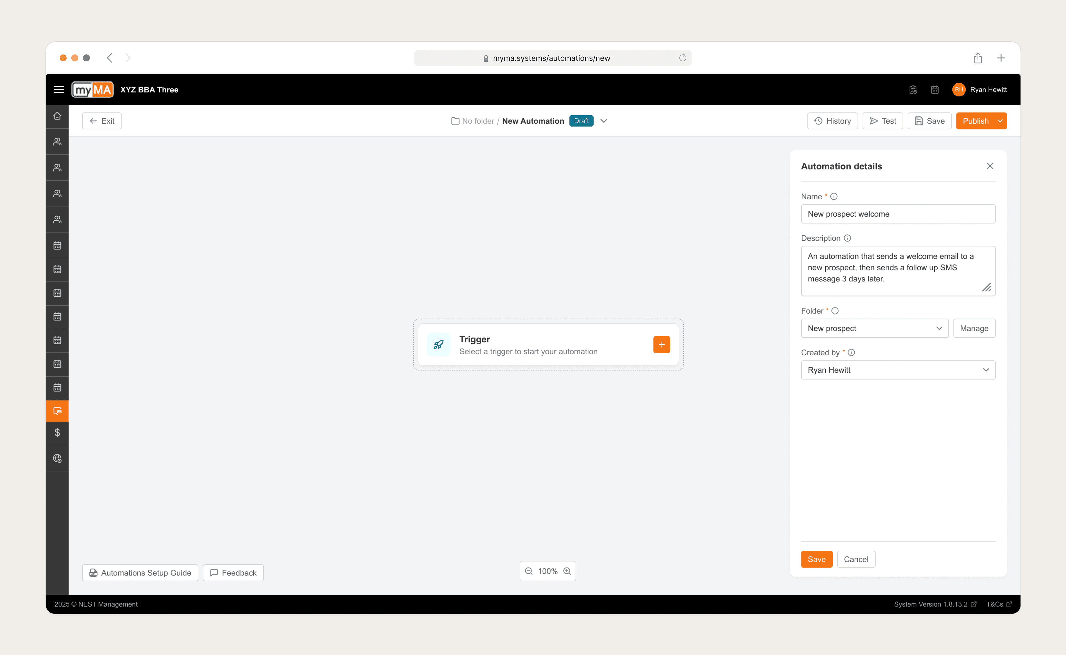
Fig 3. All Automation started with adding key metadata before selecting the first trigger.
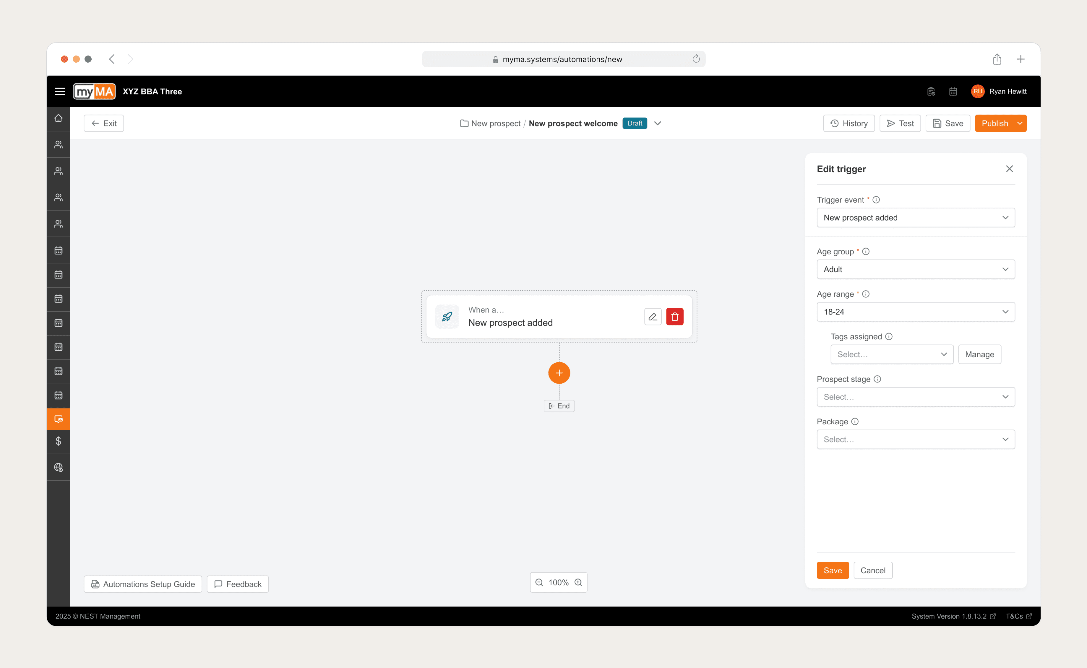
Fig 4. Users had a host of templated triggers to choose from, as well as the ability to create custom triggers.
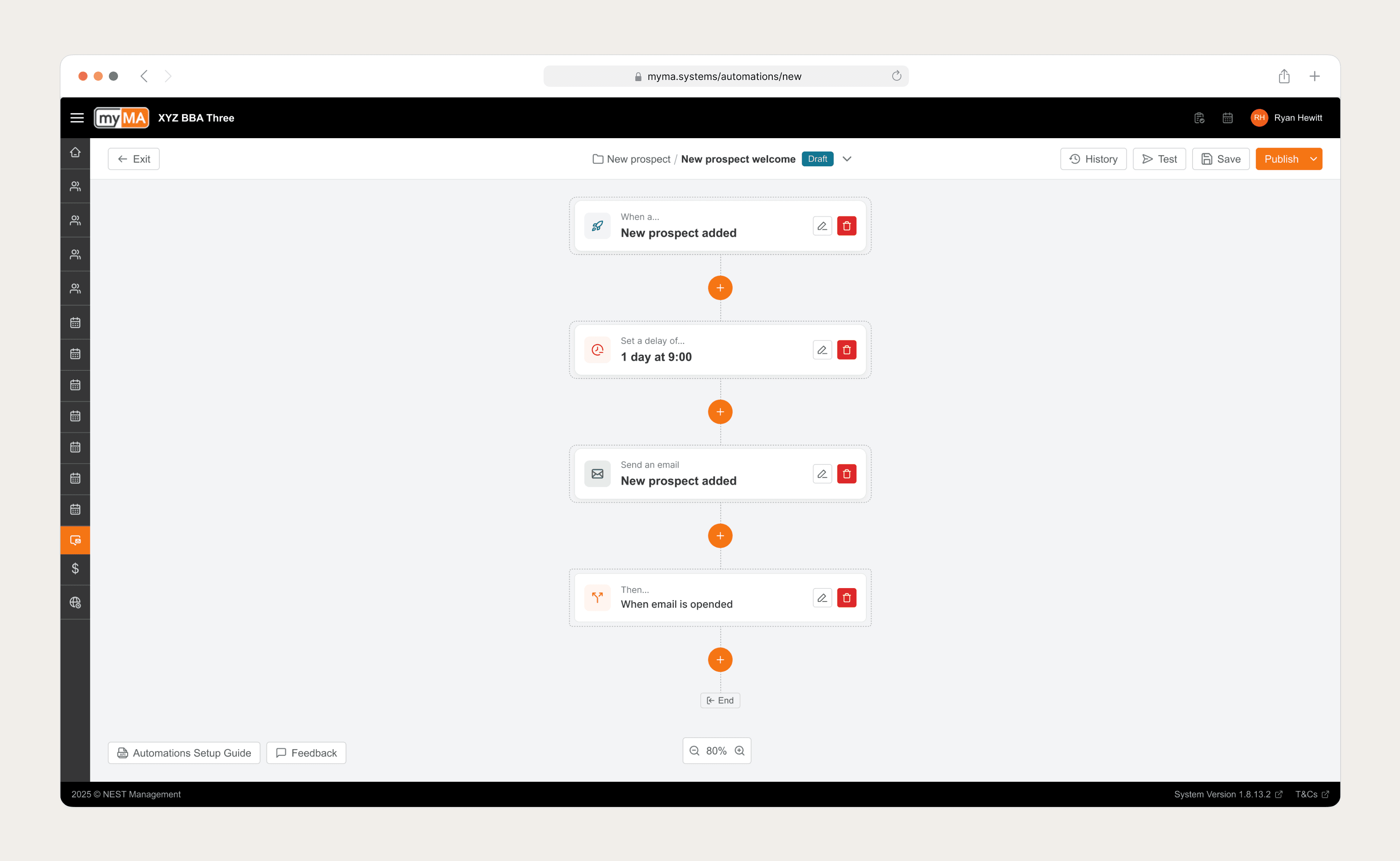
Fig 4. An infinite scroll canvas allowed users the flexibility to build their Automations whilst still seeing the connected journey of each step.
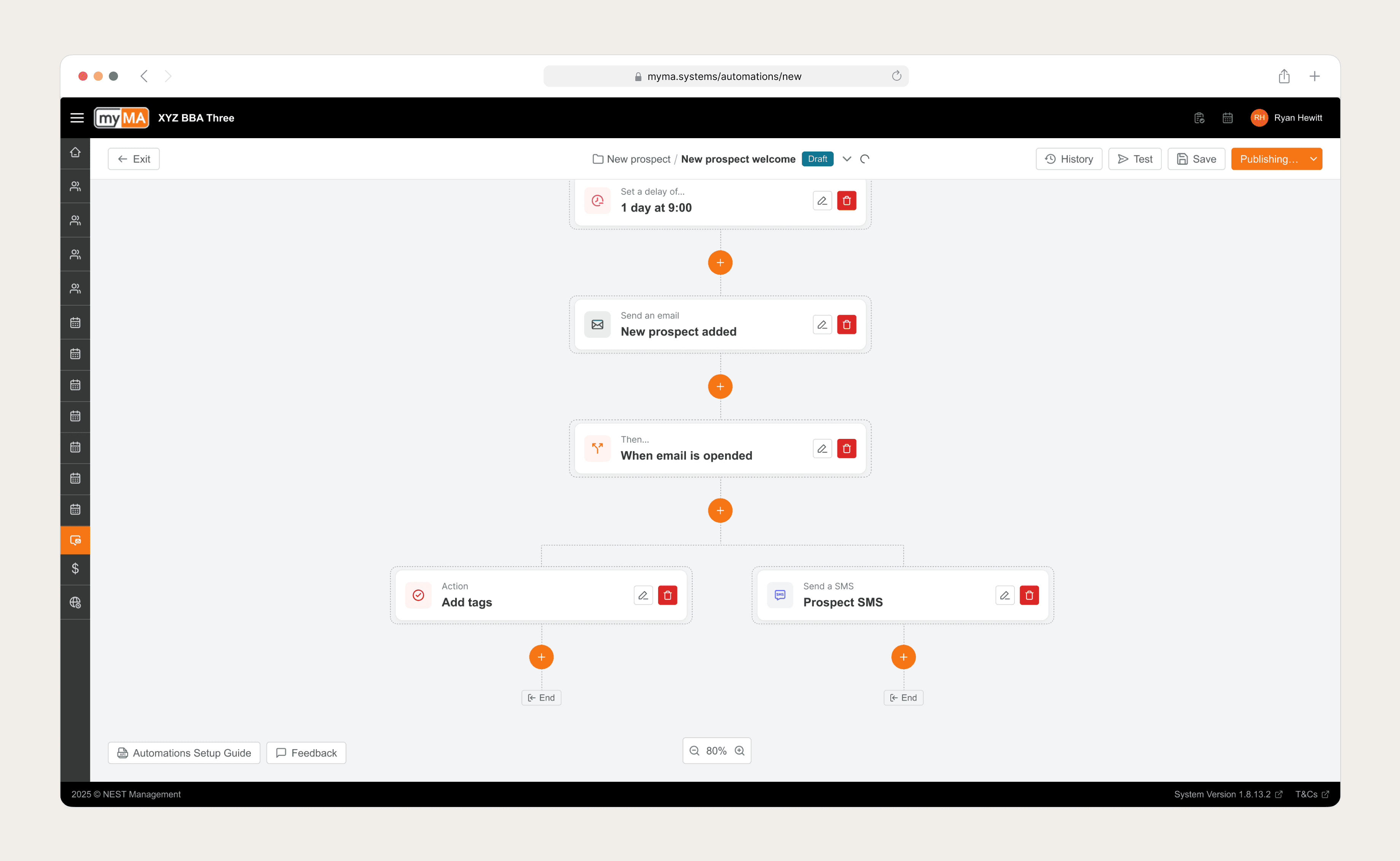
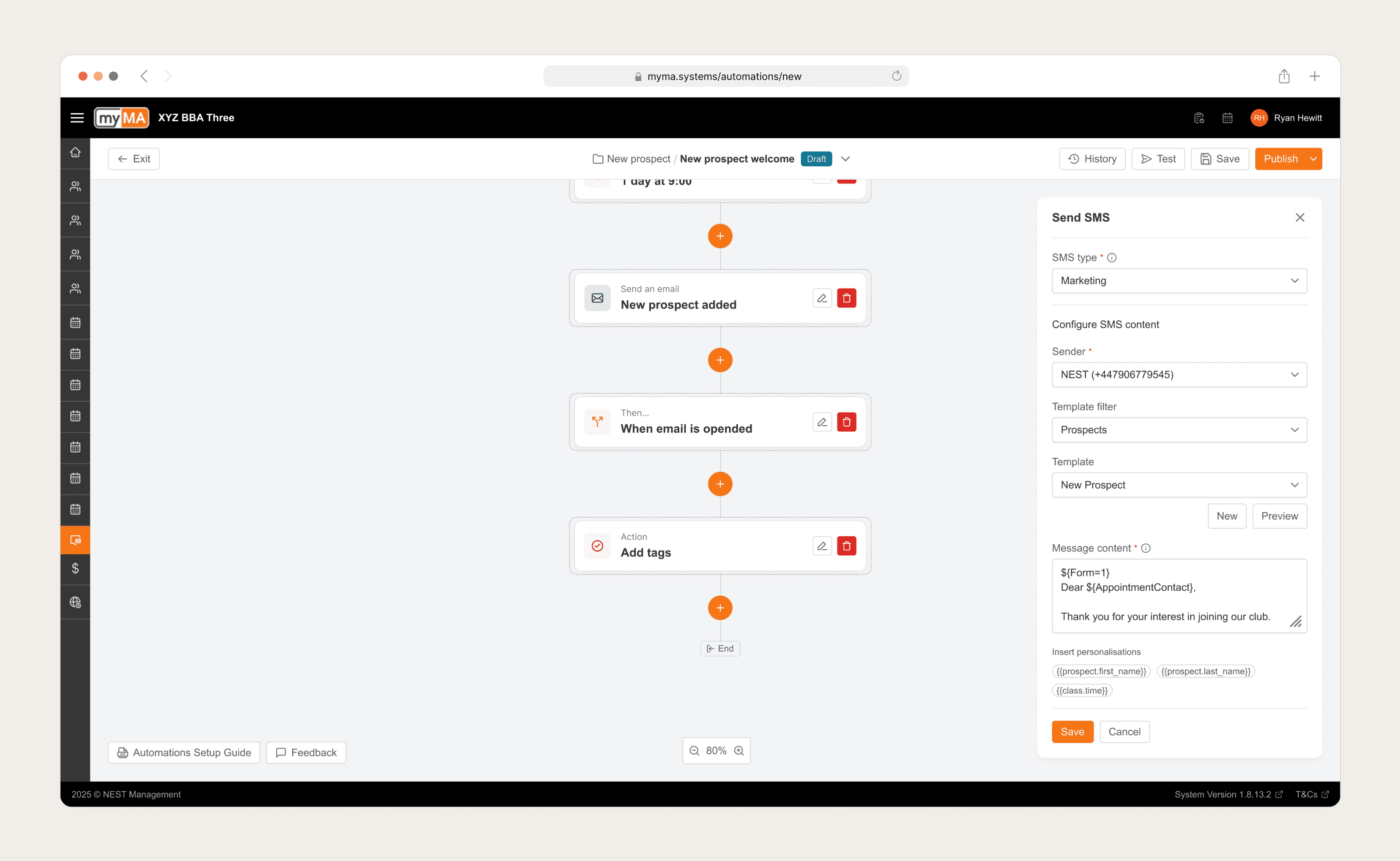
Fig 5. IF/AND/OR logic was also included within V1 of the Automation Builder, allowing users to define multiple steps for a single trigger e.g. When an email is opened, add a tag to that recipient and send them a follow up SMS.
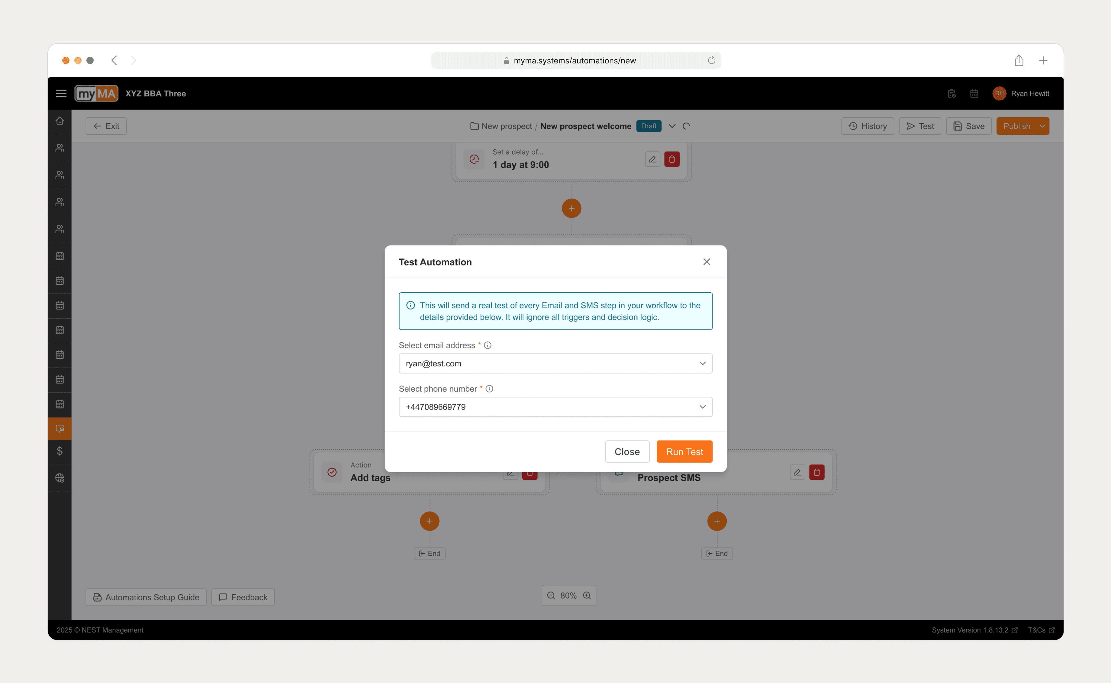
Fig 6. Users could test their automations before publishing them live. This was invaluable for new users who where not experienced in building automations.
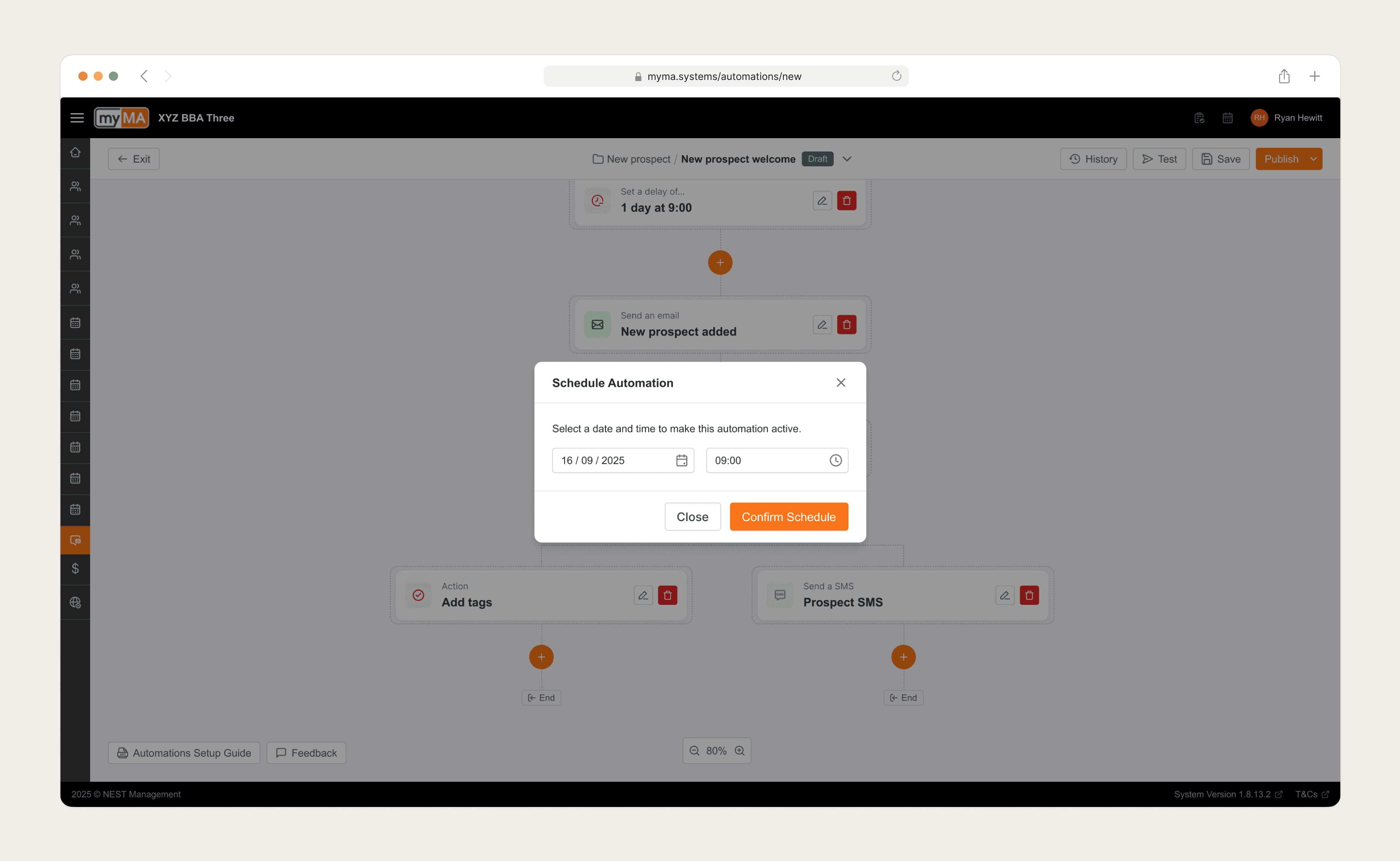
Fig 7. Alongside publishing automations straight away, users also had the option to schedule automations to line up with any campaigns they were running.
Leadership retrospective: Trust as a feature
The right problem was execution, not information. I was initially asked to "build smarter reports." The research process was critical in proving that this was the wrong path. Pivoting to the builder, despite being higher effort, was the only way to solve the root cause of burnout.
Trust is the adoption blocker. For non-technical users, automation feels like "losing control." By prioritizing the Audit Trail and Test Mode, we didn't just build features; we built psychological safety.
Complexity is a ladder. We learned that users start simple. V1 needed "Templates" to get them started. Once they trusted the system, they naturally graduated to building complex, custom logic. The design had to accommodate both the novice and the power user.
Go Back