Boosting 'Pay by Bank' adoption by 22% through trust-first design
Designing a Pay by Bank journey for Oakbrook Finance that increased one-off loan repayments by 18% and cut support tickets by 12%.
Role
Senior Product Designer
Timeline
2 months
Team
1 Designer, Product, Engineering, Compliance & Operations
Skills
Product Design, User Research, UX Writing, FinTech, Open Banking
TL;DR
The problem: Oakbrook was paying significant processing fees for every card payment. They wanted to shift users to "Open Banking" (Pay by Bank), a cheaper and faster method. However, adoption was near zero because users didn't trust the technology.
The solution: I led the design of a "Trust-First" payment flow. We rebranded the scary technical term "Open Banking" to "Instant Payment," added bank-grade security assurances, and used comparative UI to highlight the speed benefit.
The insight: Users weren't rejecting the technology; they were rejecting the vocabulary. 65% had never heard of "Open Banking" and associated it with "data scraping." They needed familiar language and visual proof of security to feel safe.
The outcome: The new flow achieved a 22% adoption rate within one week (vs 0% prior), saving the business £45k/year in fees and saving customers 46 seconds per transaction.
How do you convince people to connect their bank account to a loan provider?
My goal was to solve a business problem (high payment costs) by solving a user problem (slow, manual card entry). Open Banking was the silver bullet: it's cheaper for us and faster for them.
But there was a catch: Trust.
As the Senior Designer, my challenge was to take a feature that users viewed with suspicion ("Why do you need to see my bank?") and reframe it as a feature that empowered them ("Pay instantly and securely").
Why was a superior technology failing to launch?
Oakbrook was bleeding money on transaction fees. Every time a customer paid via debit card, a third-party processor took a cut.
The business had a clear OKR: Get 25% of customers to use Open Banking.
But when we looked at the current landscape, the barrier was psychological. "Open Banking" sounds invasive. Customers thought we wanted to read their statements, when all we wanted was to initiate a payment.
Uncovering the "trust gap" in our terminology
I needed to deconstruct the fear. Why were users sticking to the slow, annoying process of typing out 16-digit card numbers?
I launched a survey and conducted 5 user interviews to dig into the sentiment. The data was stark:
Knowledge gap: 65% had never heard the term "Open Banking."
Trust barrier: 67% said they wouldn't use it because "it doesn't feel safe."
The "unlock": 73% said they would use it if they saw a clear security explanation and if it was faster.
We realized we had a Branding Problem. We were selling "Open Banking" (a regulation), not "Instant Transfer" (a benefit).
Reframing the proposition from technology to benefit
The research gave us our strategy: Reframe the value.
We hypothesised that if we stopped talking about the tech and started talking about the benefit (Speed + Security), users would switch.
Operationalising trust through UI choices
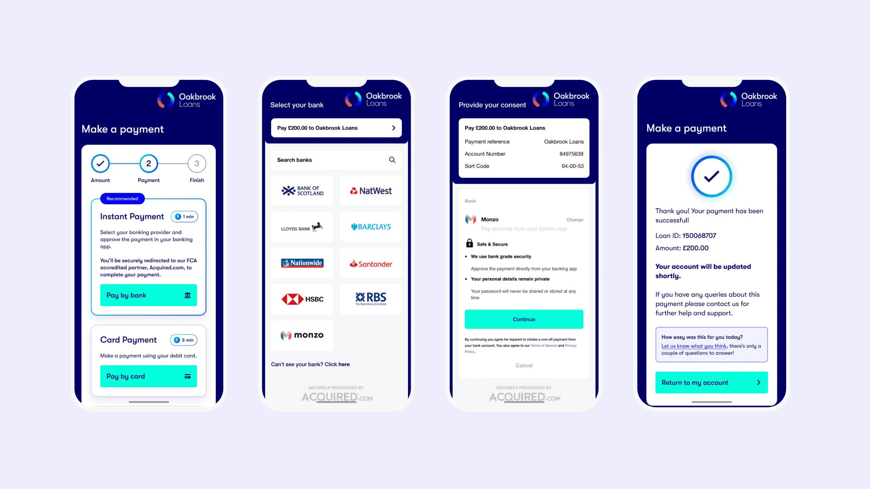
To operationalise trust, I made three specific UI choices.
The "Recommended" nudge: I didn't just list the options equally. I visually promoted "Instant Bank Transfer" with a "Recommended" badge and a specific time-saver promise ("1 min"). This leveraged the status quo bias; if the app recommends it, it must be the "normal" way to do it.
Trust-based copywriting: We added explicit micro-copy under the button: "Bank Grade Security. You will be securely redirected to your own banking app." This answered the fear ("Are you stealing my login?") before the user could even ask it.
The "Bridge" screen: Instead of dumping users straight into a third-party provider (Acquired.com), I designed a transition screen. It explained exactly what was about to happen: "We are taking you to Barclays... You will approve the payment there... You will be brought back here." This removed the shock of the app switch.
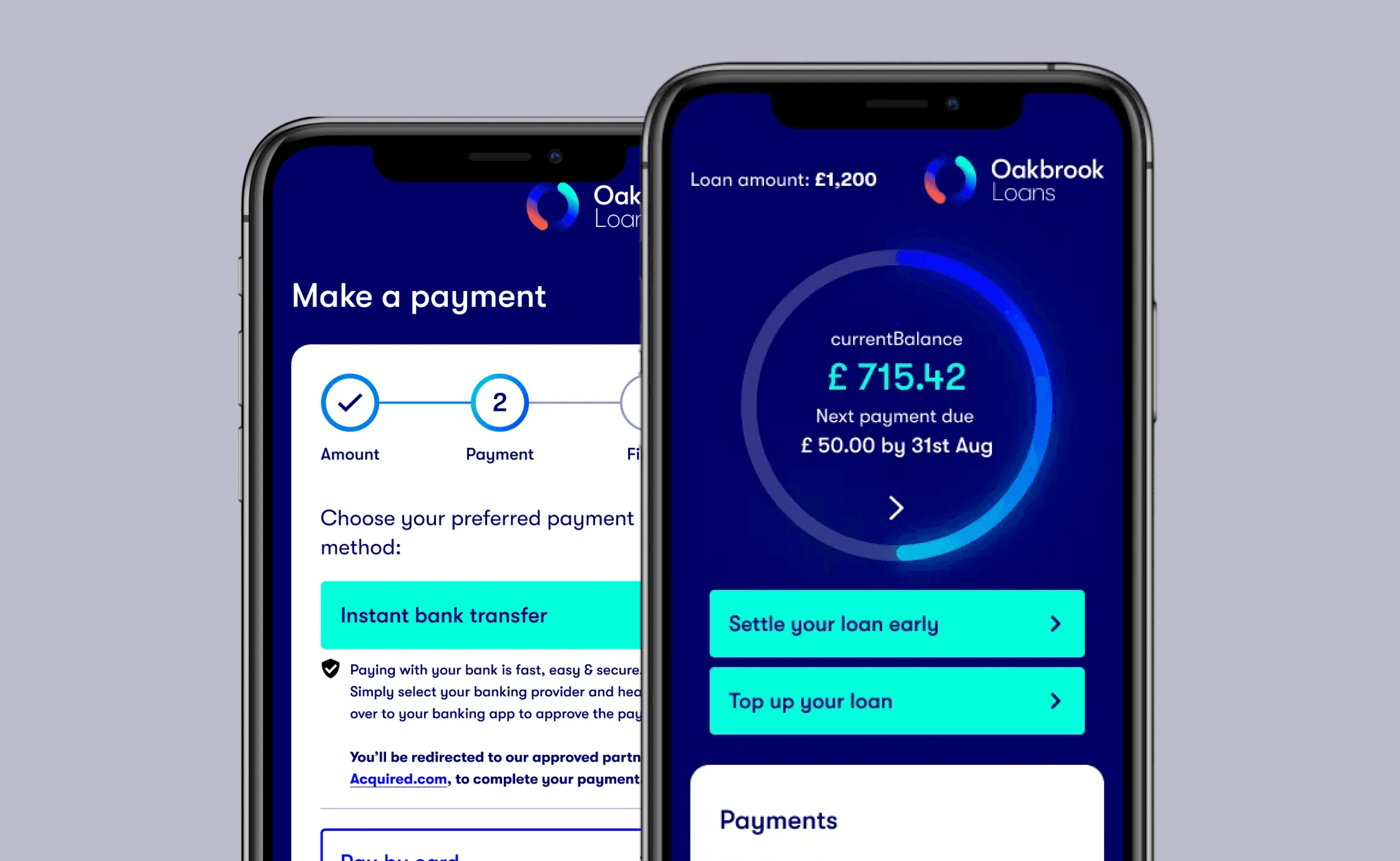
Where we landed: A friction-free payment flow
We launched the feature across all Oakbrook brands (Likely Loans, Finio) with the new flow.
The "Instant" promise Customers select their bank from a familiar list of logos (Barclays, Monzo, HSBC). This visual recognition (seeing their bank's logo) increased conversion by making the experience feel personal.
The "No-Typing" Joy The killer feature was the removal of data entry. Users simply used FaceID to log into their bank, tapped "Approve," and were done.
Reflecting on trust as a conversion metric
Trust is the currency of Fintech. You can't engineer your way out of a trust deficit. We had the best tech in the world, but nobody used it until we wrapped it in a layer of human assurance and familiar language.
Micro-copy matters. Changing the button from "Open Banking" to "Instant Bank Transfer" was the single most impactful change. It shifted the user's mental model from "Data Sharing" to "Payment Sending."
Friction isn't always bad. The "Bridge" screen added a click, but it increased conversion. Why? Because it gave users a moment to mentally prepare for the app switch. Sometimes, slowing down is speeding up.
Go Back