Unlocking £1.3M annual revenue through modular design strategy
Transitioning the Pets at Home homepage from a static storefront into a dynamic ecosystem hub, connecting retail with care services.
Role
Lead Product Designer
Timeline
1 month
Team
Design, Brand, Content & Marketing
Skills
UI/UX Design, Design Systems, Accessibility (WCAG), User Research
TL;DR
The problem: Pets at Home is a holistic pet care provider (Vets, Grooming, Insurance), but their website was just a shop. Users treated it purely as an e-commerce site, completely missing the high-margin service offerings that drive long-term value.
The solution: I led the strategic redesign of the homepage, moving away from hard-coded banners to a Modular Design System. We built a flexible "Lego-style" architecture that allowed Marketing to mix-and-match content blocks, prioritising services alongside products.
The insight: The issue wasn't that users didn't want the services; they simply didn't see them. We needed to stop thinking like a retailer (selling SKUs) and start thinking like a partner (solving problems).
The outcome: The modular redesign identified an estimated £1.3M annual revenue opportunity in cross-sell subscriptions.
How do you tell a customer you're more than just a shop?
My goal was to break the "Retail Silo." Pets at Home had a unique competitive advantage: they own the entire pet lifecycle, from the puppy crate to the vet appointment. But their digital presence was stuck in 2010 e-commerce thinking; buy item, leave site.
As the Lead Product Designer, my challenge was to re-architect the front door of the business. I needed to create a flexible hub that gave equal weight to a bag of kibble and a monthly vet subscription, without cluttering the UI.
Why did users see a supermarket instead of a partner?
I found a critical Perception Gap.
While the business viewed itself as a "Pet Care Ecosystem," the website screamed "Supermarket." The homepage was dominated by low-margin product offers. High-value subscriptions (like the "Complete Care" package) were buried in footers or obscure menus.
This resulted in:
Siloed traffic: Users bought food online but went to competitors for insurance.
Static content: The hard-coded layout meant Marketing couldn't easily swap out campaigns or personalize the experience for different pet types.
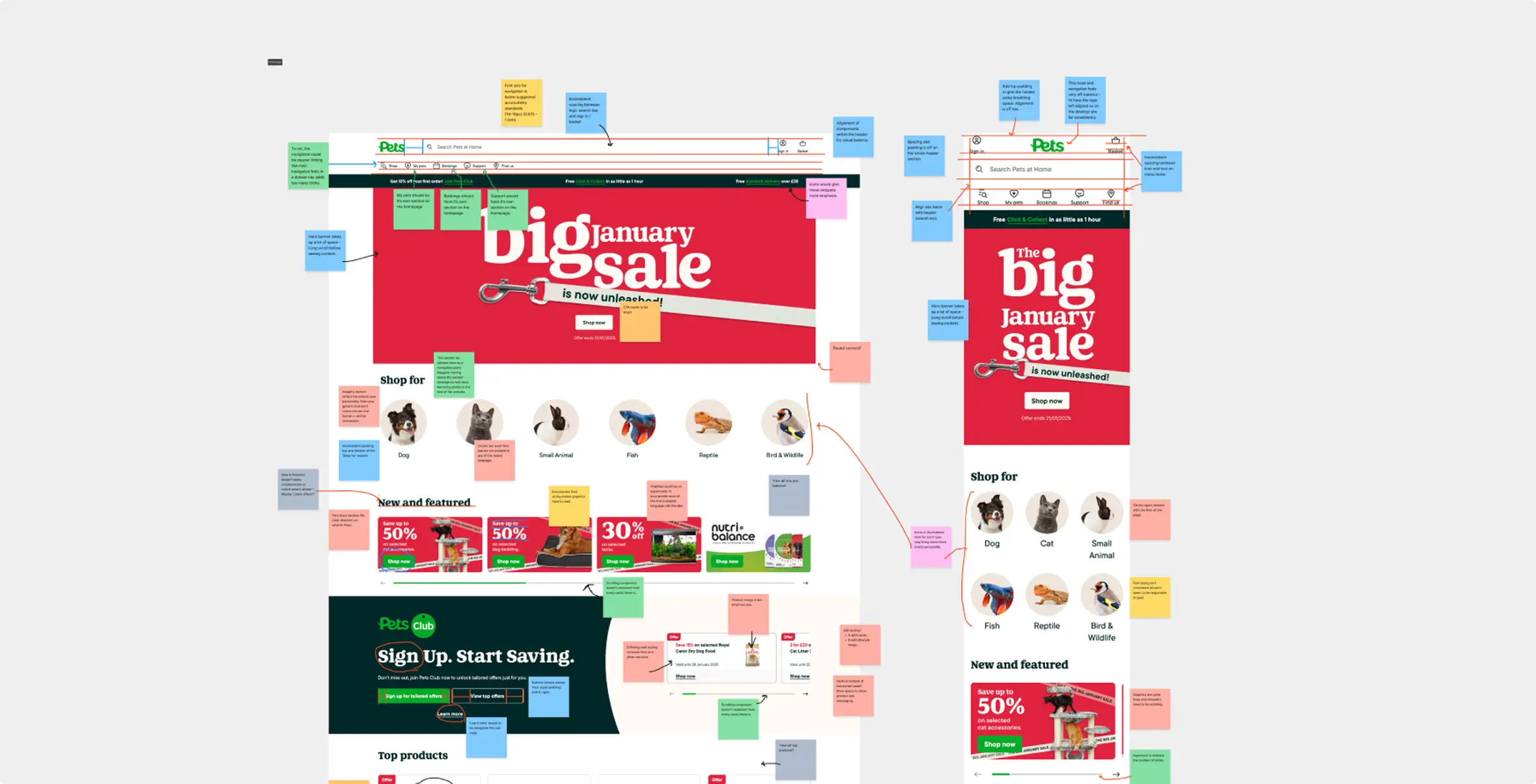
Fig 1. UX audit of the current Pets at Home homepage.
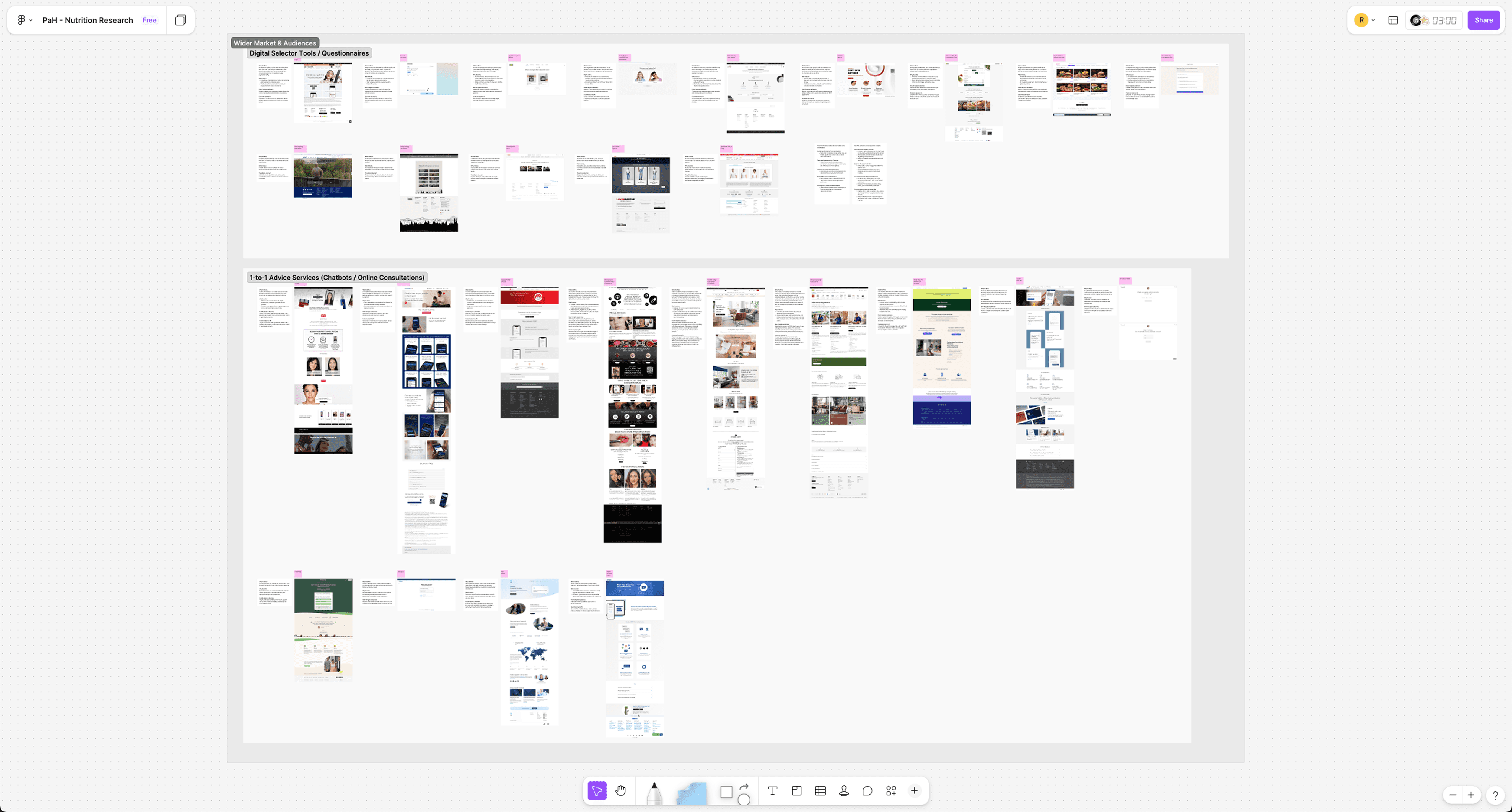
Fig 2. Competitor research against PAH's competing brands and others outside their industry.
Uncovering the "blindness" to PAH's service offerings
I led a discovery sprint combining competitor benchmarking with user interviews. The findings confirmed our fears: Blindness.
Users weren't ignoring the service banners; they were filtering them out because they looked like ads.

This insight changed our strategy. We didn't need "flashier banners"; we needed integrated journeys.
Turning a transaction into a relationship
The opportunity was to move from Transactional to Relational.
Building a system that empowers the team
To make this sustainable, I focused on scalability and systems.
The modular component library: I killed the "Custom Page" approach. Instead, I designed 12 standard "Content Blocks" (e.g., Hero, Carousel, Feature Grid, Testimonial). This allowed the CRM team to build new landing pages in minutes, not days, ensuring the site could keep up with retail speed.
Personalisation-ready architecture: The blocks were designed to be dynamic. If we knew the user owned a senior cat, the "Hero Block" could automatically swap the "Puppy Food" image for "Joint Care Supplements." This laid the groundwork for 1:1 personalization.
The "unified" navigation: I redesigned the primary nav to give "Book an Appointment" the same visual weight as "Shop by Category." This subtle UI change signaled to every visitor that doing was just as important as buying.
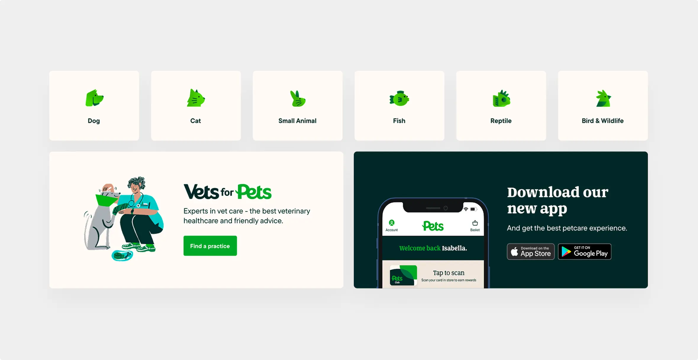
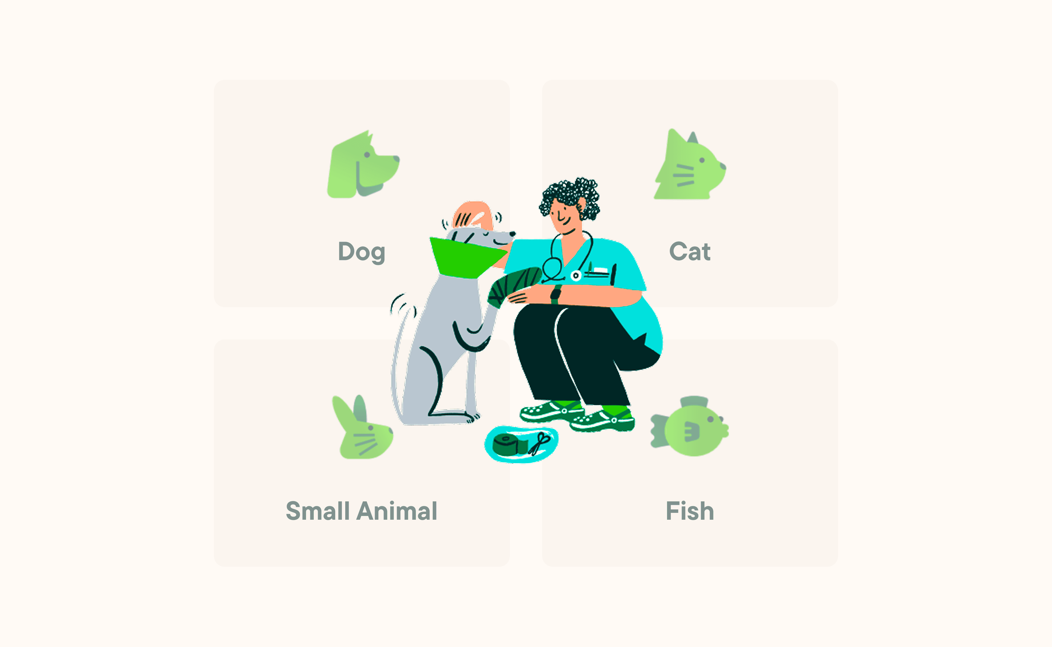
Fig 4 & 5. Design system components and brand led UI elements.
Where we landed: A modular launchpad for growth
We delivered a fully responsive, component-based homepage design that acted as a launchpad for the brand's future.
The "ecosystem" header
A reimagined hero section that didn't just push products, but highlighted the "VIP Club" value proposition, driving users toward the sticky subscription model.
The "service" injection
I strategically placed "Vet Booking" and "Grooming" modules above the fold on mobile. This ensured that even quick visits resulted in brand awareness for services.
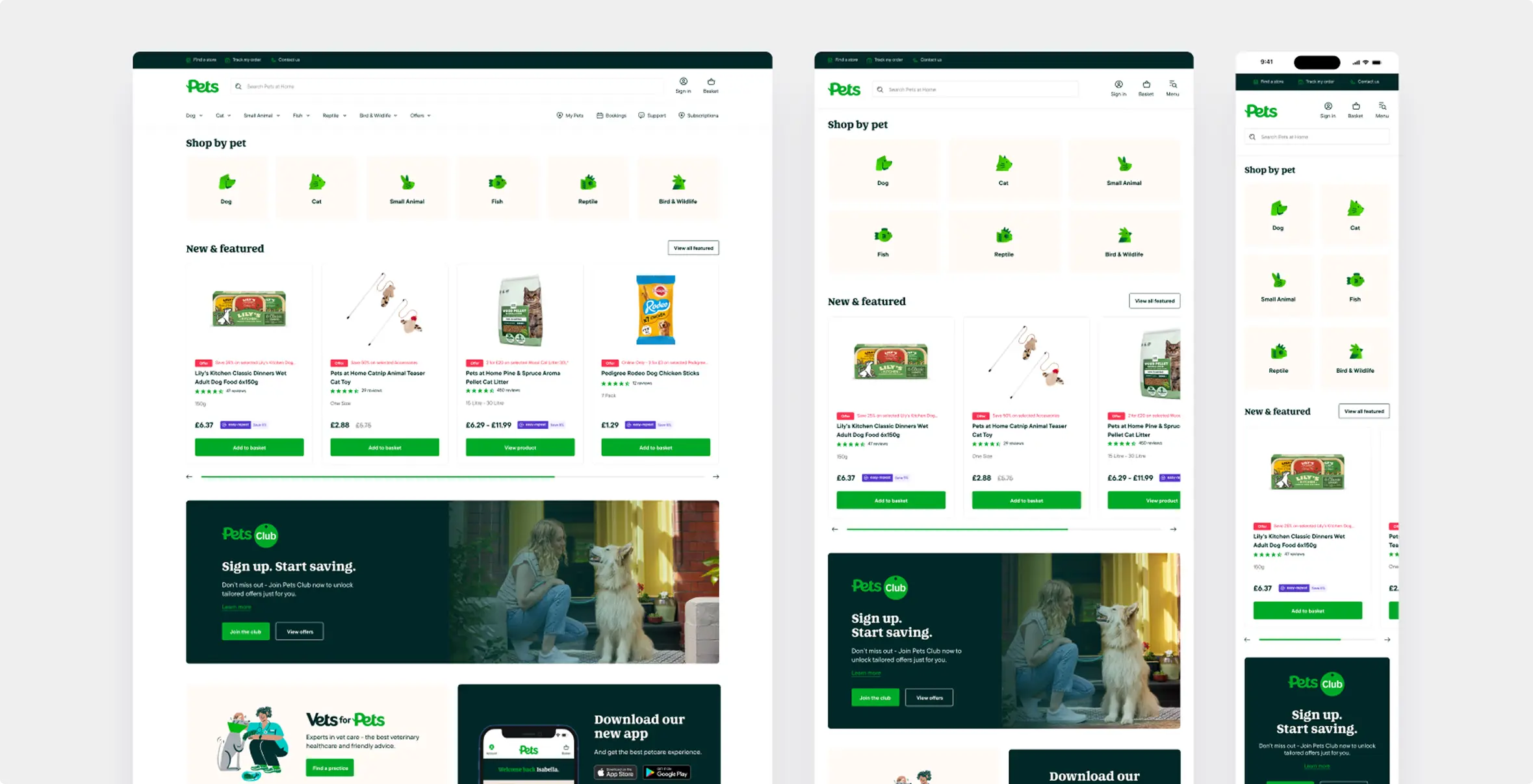
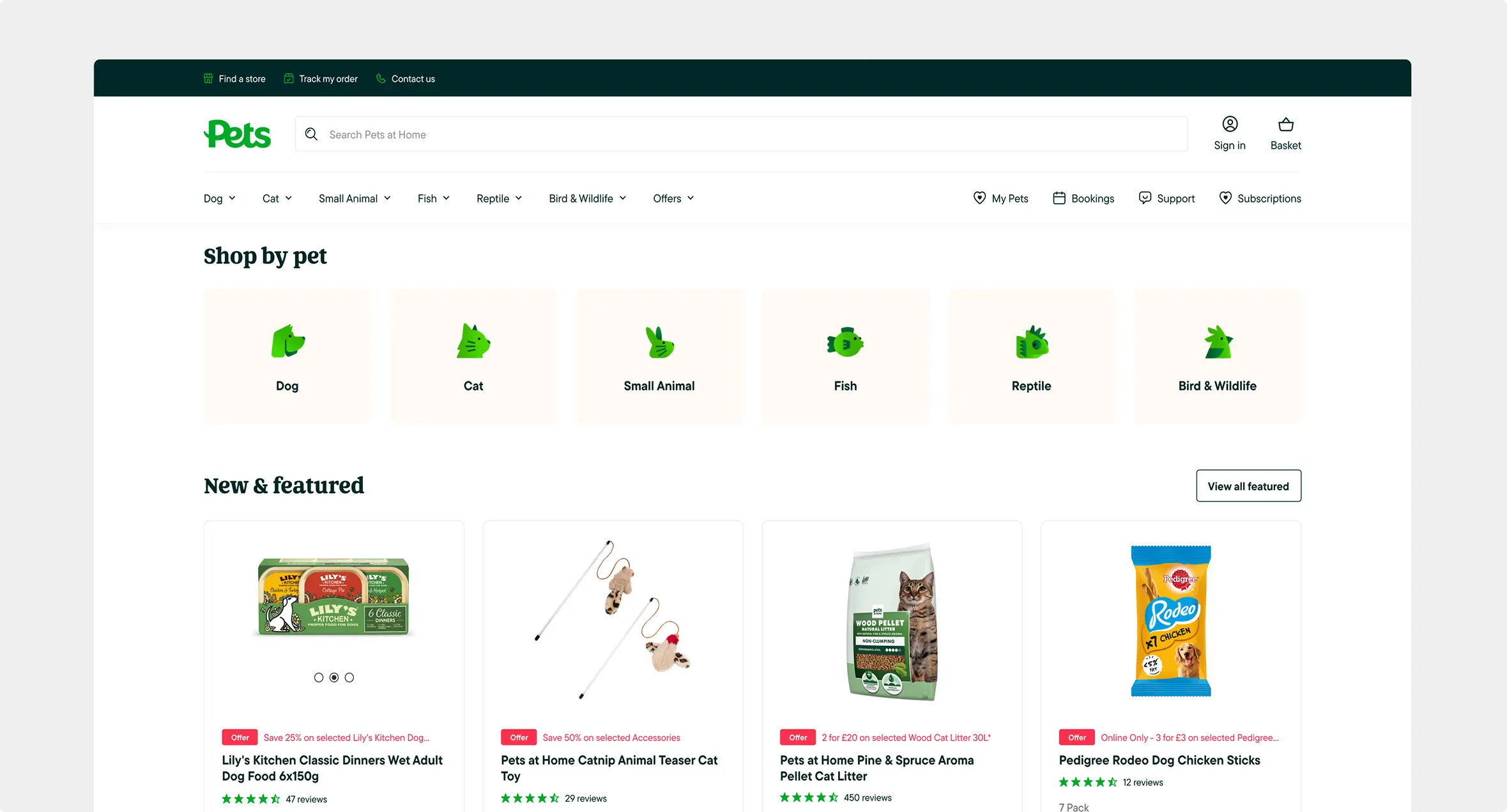
Fig 3. Scalable design components across desktop, tablet and mobile.
Reflecting on design as a business driver
Design is about business strategy. This wasn't just a UI refresh; it was a business model shift. By changing the pixels, we changed the business metrics from "Cart Value" to "Lifetime Value."
Systems save sanity. Moving to a modular system was the biggest win for the internal team. It empowered Marketing to run experiments without needing Engineering time for every pixel change.
Don't fight user intent; guide it. Users still came to buy food. We didn't stop them. We just made sure that while they were walking down the aisle, they saw the vet's office door open.
Go Back